Picture this. You spend time and effort picking out the best shade of purple, a bold display font, and designing a flawless prototype only to be rejected by the client. We've all been there!
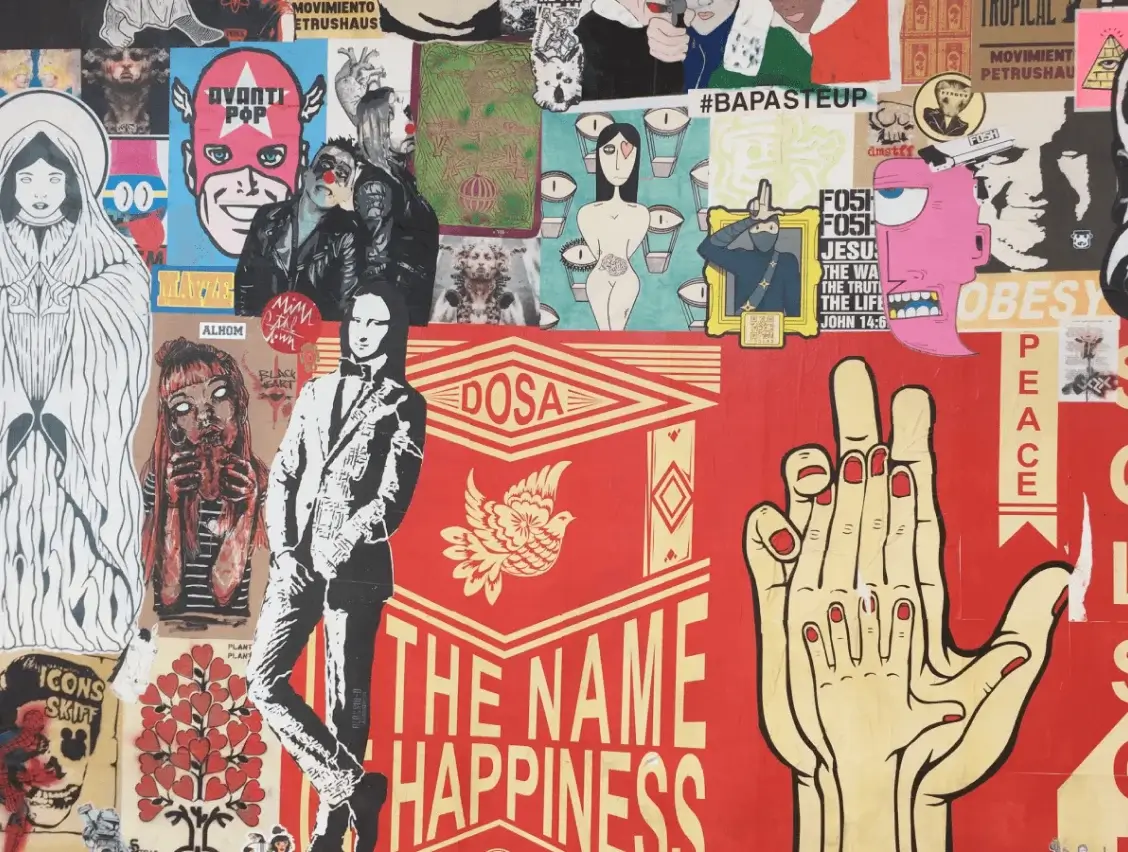
Setting the mood for any project is a key step to allow team members and clients to get on the same page. One effective way of doing this is by building a mood board. As designers, when we use words like "brutalism design" or "Grotesk fonts", our clients could be clueless but throw it all together in a mood-board and they will immediately relate to whether or not they like the concept.
Mood boards provide a “space” to arrange collected visuals in a meaningful manner to the designer that enables the flow of thoughts, inspirations, and creativity for design outcomes—products. - Tracy Diane Cassidy
What is a mood board?
A mood board is a collection of different kinds of elements; from images to textures that help collate and visualize concepts. In a broader sense, a mood board should evoke specific feelings and attributes. You can create a mood-board for just about any concept; for a product/service, an idea, or even your favorite type of art (Believe it or not, I created a mood-board to put together this article!).
What you choose to put on your mood-board is your prerogative; there are no right or wrong answers. The important thing is to include as many elements and ideas that best suit your brand and convey its message. Here are some general elements to include:
- Images: Pull in some of your favorite designs from Dribbble, brand images, the type of stock images you're leaning towards, and even your brand logo.
- Typography: Deciding the typeface for your brand is never easy. Add in fonts or typefaces you're more inclined to and see if it matches the story you're trying to build.
- Colours: Create a color swatch of your brand colors and try incorporating them into your mood-board wherever possible.
- Illustration Style: Play around with illustration styles and choose what best suits your brand to maintain consistency.
- Textures: Using images and words to tell your brand story is one thing, but try including patterns, textures, and shapes that would help invoke your brand's emotions.
Collecting inspiration
Gathering inspiration for a mood board can come from anywhere! As designers, we tend to hoard all our favorite designs in a swipe file, so that's a great place to start. All the other mood boards you've built are also great sources of inspiration.
- For aesthetic, stock photos use sites like Unsplash and Pexels
- To build vibrant and complementary color palettes you can use Coolors or Khroma
- For typography, browse through Typewolf or Awwwards
- Social media platforms like Instagram and Pinterest have a lot of fresh and raw ideas that could help you understand your brand better
Where to build it?
There is no shortage of great tools to help you build a great mood board. My go-to favorites are:
Now that we've established what a mood-board is, what to include on it and where to build it. Here are 5 tips that will help you create an effective mood board:
1) Have a sense of direction ↗️
Getting started on a project is always challenging. There are infinite combinations of design and texture and colour that shape the overall look of the product. While it's easy to get lost in the clutter and get overwhelmed, it is necessary to remember the end goal.
So how do we make sure we're on the right path? One way to do this is by always keeping in mind your mood-board statement. A mood-board statement is a design web, a combination of the basic why, how, and what questions.
- WHY are you creating this design? What purpose does it serve?
- HOW are you going to make the why happen? How will you make it stand apart?
- WHAT is the problem your design is trying to solve? What do your users want?
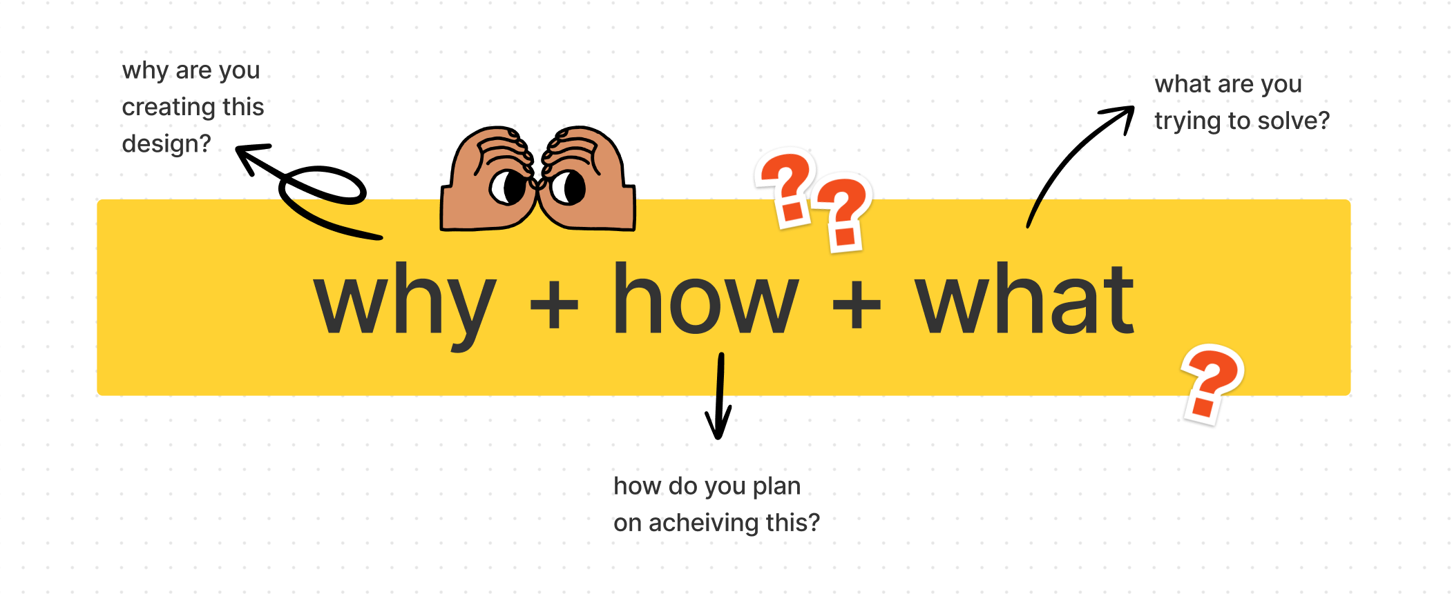
Once you combine the answers to these questions, you have a sense of direction! Put this on a sticky on top of your mood-board and get started
2) Keywords are your best-friends! 💞
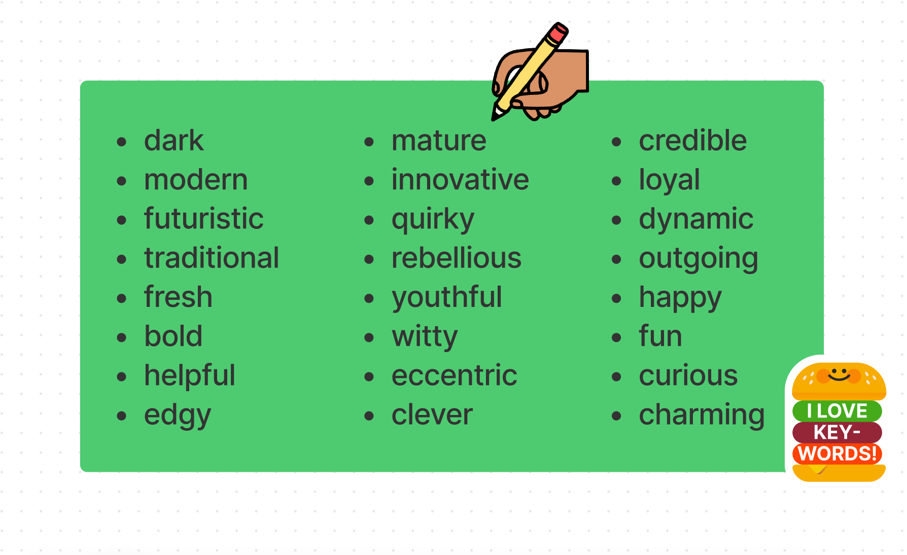
Before you begin pulling in aesthetic pictures from Pinterest, take some time to understand the brand you're building. Your mood-board is in no way a reflection of the exact end product but a means to help you determine the style. On a sticky, or using spider diagrams or even on pen and paper jot down as many adjectives that best describe the vibe you're going for. Don't be afraid to throw in words like "batman" or "gooey" (it's a safe space), but aim to stick to under 6-8 words so it doesn't get chaotic.
Here are some of my favourite ones to get you started:
3) Don't be afraid to annotate 🔤
Who said it's all about the visuals? There's nothing wrong with including annotations on your board. Not everyone thinks or designs in the same way for e.g. when your co-worker looks at something you’ve found meaningful, they might not understand why. Feel free to add descriptions under the elements to explain the purpose it serves. This helps keep everyone on the same page and reduces skepticism.
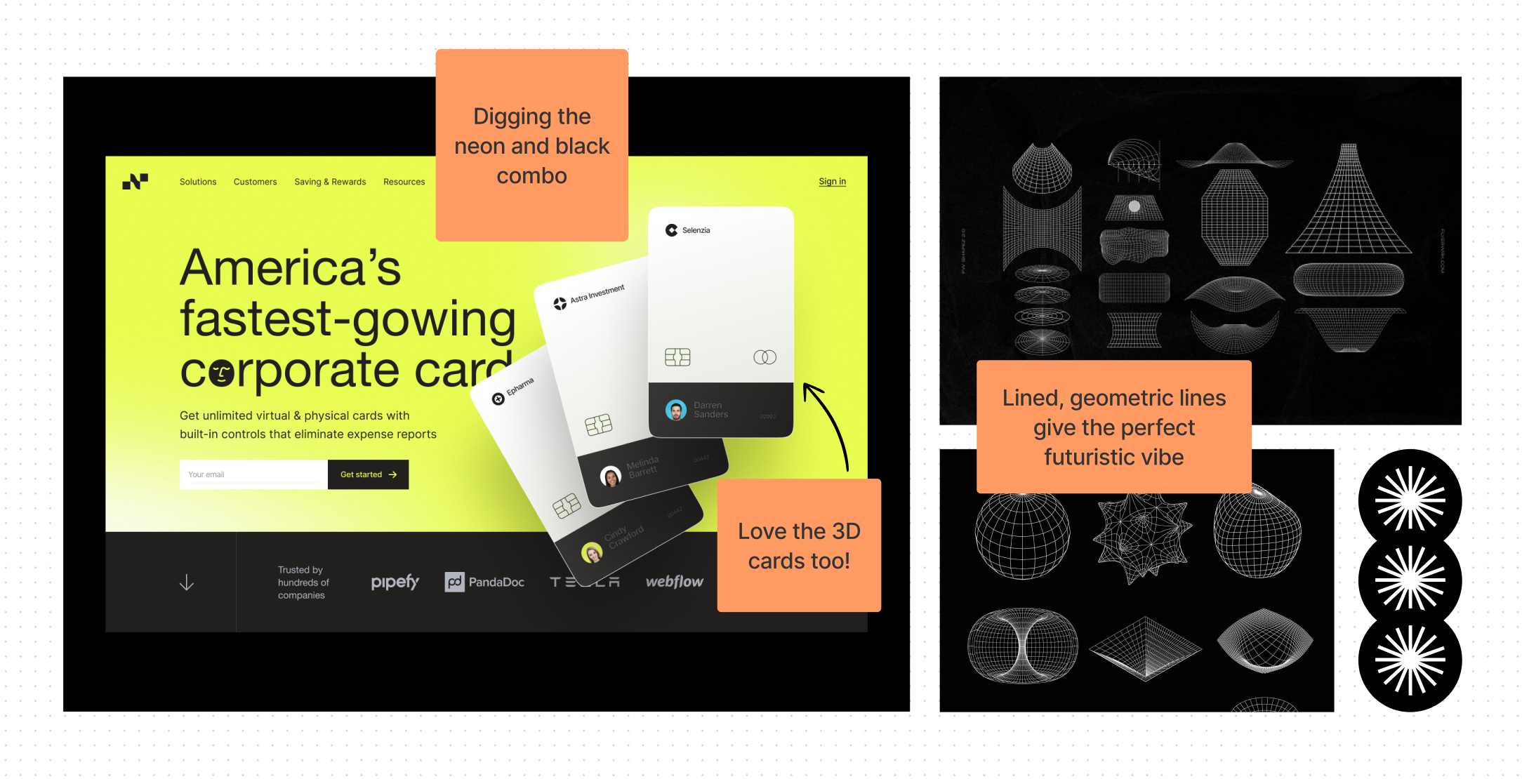
4) Stay on the lookout for common themes 🎭
A layman looking at your mood board should be able to pick out some common themes or elements; whether that’s a colour pattern or a specific message. Sometimes, it won’t come together until everything's up on your board, and that's okay too. Think big then Think small. One way to do this is by breaking down your mood-board into tinier mood-boards based on similar patterns and eradicating the outliers.
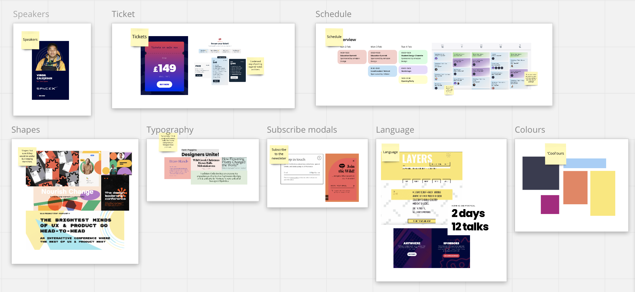
5) Add a little spice 🌶️
Don't be afraid to mix it up! While searching for inspiration it's not necessary to just pull in digital designs, for inspo look into magazine designs, fashion pages or even tattoos! Add some fun textures and patterns. If you're feeling adventurous, take a walk and see what the universe is offering. Grab your phone and click a few pictures of whatever speaks to you. Getting inspired from different sources prevents you from falling into a visual rut and designing the same things every time.

Enjoyed this article? Don't miss out on more exclusive insights and real-life digital product stories at LeadReads. Read by Top C Execs.
Join here.
Final thoughts
The process of building mood boards helps guide any creative process. Besides being fun and inspirational, putting together a mood board also allows everyone to be on the same page before the actual design begins. While looking for inspiration don't forget to keep the end goal in mind; keep going back to your mood board statement and keywords. It's a great way to keep you and your brand in check.
If you've never made a mood board for your brand/product, start today!
If you're a mood board master, let us know what tips you have for mood board making on Twitter


