Don't you love Canva's drag & drop design resources? Are you looking for the same in a versatile tool like Figma? Figma's community templates are here to the rescue.
Figma has a versatile community of designers who create templates you can use. Templates range from file structure templates to entire landing pages.
When designing a user interface in Figma, it is always handy to have a bunch of templates in hand. Templates make your life easy by allowing you not to repeat things.
In this article, we have filtered through the countless Figma templates to come up with our top 20. We believe having this by your side will help you get the ground running as a designer.
Note: These templates are not placed in any order. Each template serves a different use case.
Let's start with some learning. These resources are from Fons Mans, a designer from the Netherlands. He regularly publishes templates and tutorials. These reusable files range from invoice templates to tutorials on creating iOS wallpapers - all in Figma. These templates can be used to understand what Figma is capable of in graphic design. Play with each file's small tips and tricks and create your illustrations.
We especially liked how 3D effects can be done using shadows and blur in Figma. This template will be worth downloading if you want to learn cool tips and tricks in Figma. Download the templates here.
Features Include:
• Reusable illustrations
• Step-by-step tutorials on how to design things
.png)
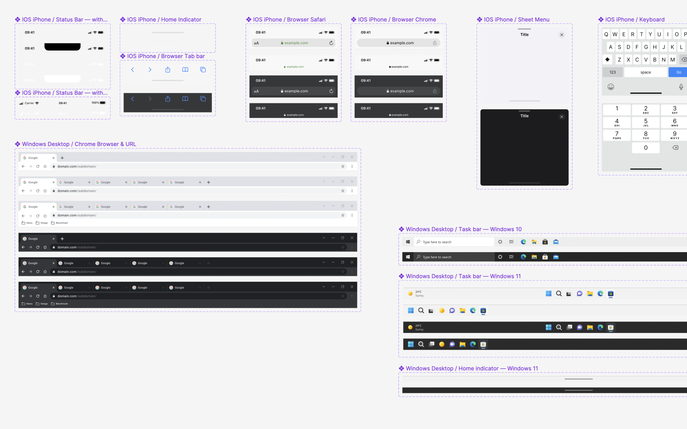
Often, however good the design is, it might look slightly different on different devices. This kit by Julien Fovelle has got you covered. This file has all status bar templates for all devices, for Windows, macOS, iOS, and Android. Status bars are a small aspect of UI design, but they can make your design look close to what the user will see.
Sure, you can create a bunch of status bars from scratch. But the whole point of templates is to give you a head start. One primary reason to choose this template over the others is that everything is made of reusable components and variants. And guess what? This template also contains keyboard designs for all devices. But make sure to publish this library to whatever file you're working in so you access these components directly from the assets panel. So, there you go - drag and drop and bring your designs close to what the user will see. Get a copy of the template here.
Features Include:
• Use of components with Auto Layout
• Includes all known devices and operating systems
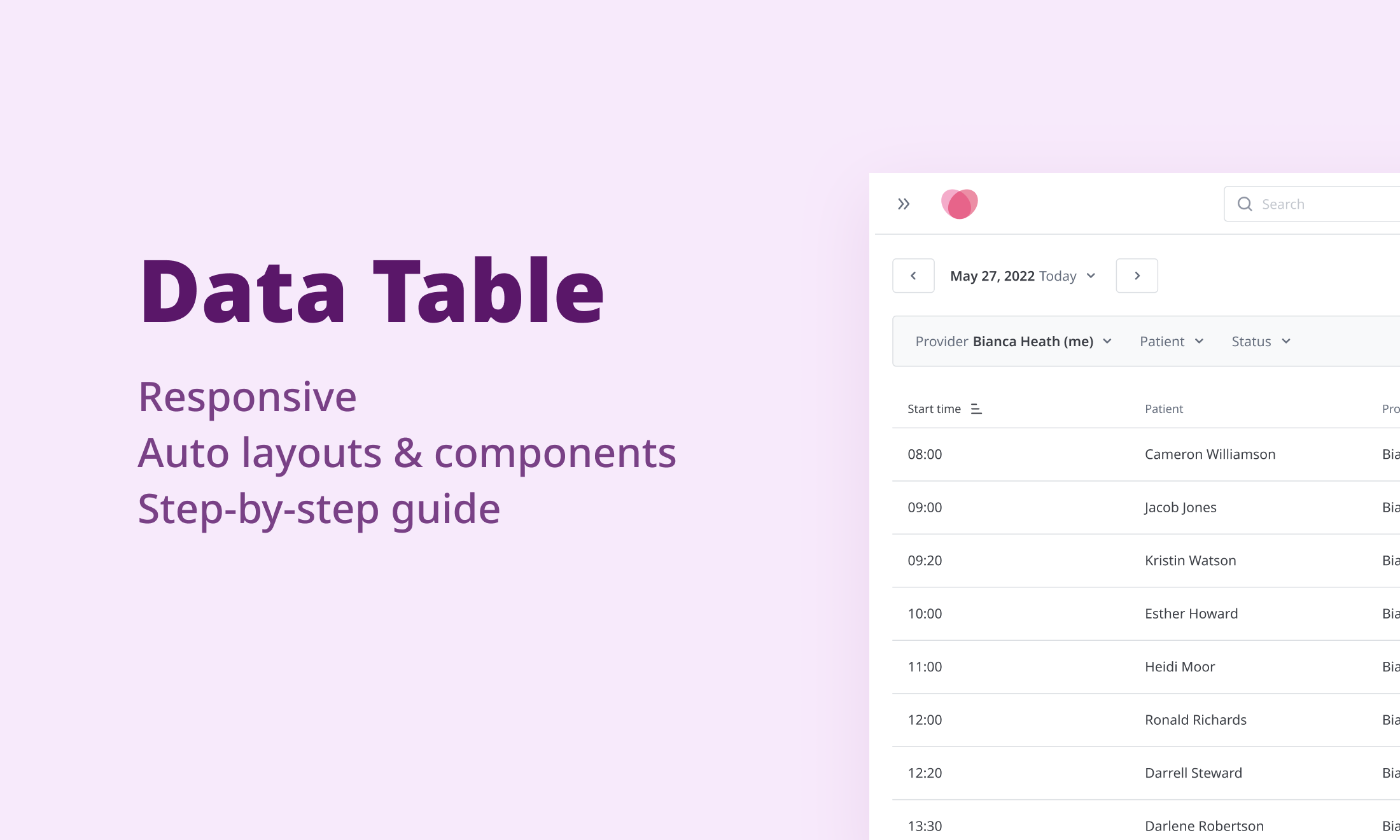
Creating tables in Figma can be a pain. Unfortunately, there's no native way to create a table in Figma - you must manually set up constraints in auto layout, which can be time-consuming. This data table by Aleksandra helps you set up a table in minutes. Since tables in Figma have a lot of nested frames, changing the constraints for one frame can affect the whole row or the entire table. So for starters, this template also includes a detailed guide on how to use the table and components. Awesome stuff! You can download this template here.
Features include
• Use of components and auto layout
• Great documentation on how to use this template for beginners
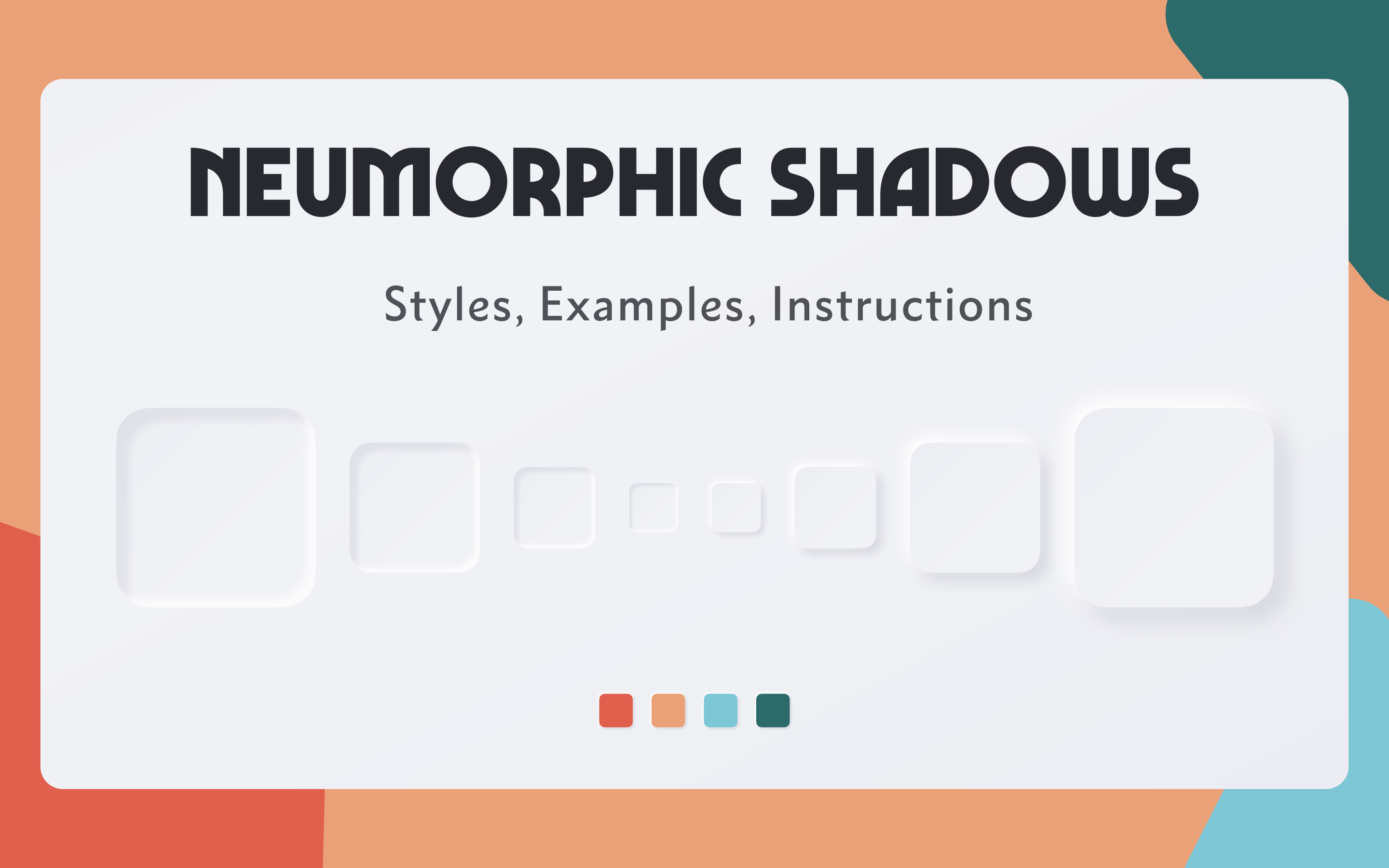
Though neumorphic UI elements have a lot of usability issues, one might use them to create some incredible futuristic mockups. There's a bit of a learning curve to create these neumorphic shadows. That's where this template comes in handy.
This template will also give you an in-depth understanding of how shadows work in general to create a 3D object. You can get access to the template here.
Features include
• Use of predefined styles
• A clear description of shadow parameters
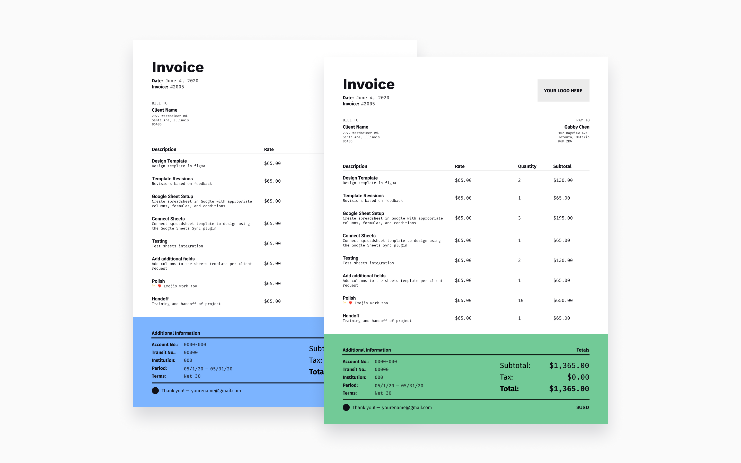
Creating beautiful invoices can be time-consuming, especially if you want to maintain the data elsewhere. This awesome template by Abel Hancock syncs data directly from Google Sheets (How cool is that!), so you can have your information neatly organized and send a beautiful invoice. All you have to do is download the Google Sheets Sync plugin to get started. Freelancers and solo creators might find this helpful. Every designer or freelancer might have a different billing structure, so this might not serve your needs out of the box. But this made our list since Google sheets sync is a game changer for anyone. Download the template here.
Features Include:
• Sync with Google Sheets
• It has a great How-to guide
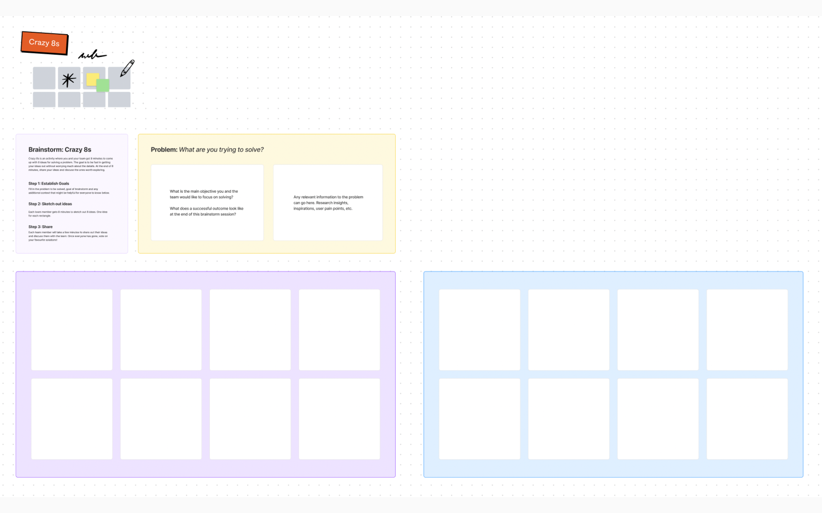
If you are a person who conducts workshops and frequently collaborates with your teammates, this one is for you. Figma has created a Crazy 8s template for you to use directly on Figjam. Get your teammates on board, collect 8 crazy ideas, vote, and discuss those ideas. Workshops can contain a lot of activities to collaborate and discuss. With Crazy 8s being one of the most common activities, you can drag and drop from this template and get started. A fun thing about this template is that the sticky notes snap perfectly into those 8 boxes! You can download this template here.
Features Include:
• Sticky notes that perfectly fit
• A template to add rules and problem statements.
Every time you design a UI for a product or website, the frame will look different when viewed on an actual device. Mockups are used to solve this problem. The Figma community has a template to place your designs on mockups of any device. Mockups also provide another dimension to your designs. We have included this template as an extension of the status bar template mentioned above. These two templates combined can give you a clear-cut idea about how your designs will look on an actual device. Images are also easily replaceable by double-clicking on the placeholder image. You can get this template here.
Features Include
• Support for all screensizes - Mobiles, tablets, laptops
• A size guide for different devices
.png)
Illustrations are a great way to make your website or product more enjoyable. All the illustrations in the Figma community are SVGs, so you can play around with the colors and mix and match things. Since the illustrations are limited per template, the best way to do this is to pick resources from multiple templates. These templates are listed based on the consistency of the illustrations and the diversity to use in various domains. All these templates provide a considerable amount of free illustrations to try out before you buy the full versions.
Enjoying this article? Don't miss out on more exclusive insights and real-life digital product stories at LeadReads. Read by Top C Execs.
Join here.
Some cool illustrations
• Lucid Illustrations by Pixsellz
• Vector Illustrations by Spencer Camp
• Deft - Modern illustrations by Manivarma Thilakaraj
• Snap Illustrations by Craftwork
• Milano Illustrations by Streamline

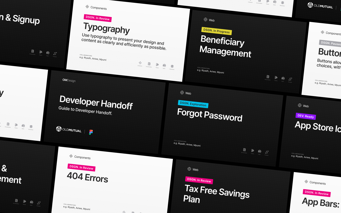
Organization of files can make a whole world of difference, especially if multiple people are working on a project. File Thumbnails are like icons. They help you create a visual identity for each file.
Thumbnails are segregated based on the file type and can be easily changed with the help of components. These come in generic colors as a template, so you can change the colors to your brand colors at the component level and start using them. Make sure to publish this library to every file in your project to access these from the assets panel. We loved the way they managed to show almost everything related to that file in the thumbnail. You can duplicate this template here.
Features included
• Tags to show the current status of the file and the file type
• Icons to show the availability of certain elements in the file
• Option to add names of designers working on the file
Are you planning to design an NFT website with cool 3D Illustrations? Guess what? The Figma community also has excellent open-source 3D resources. Though each file might have a limited number of illustrations, you can use multiple files to create combinations. A downside of using these resources might be that these are just PNG images and are not editable. We've picked a few of the best, considering the number of 3D resources and diverse styles.
Some 3D resources:
• SALY - 3D Illustration Pack by Alzea
• Nikuu 3d Illustration Pack by Paperpillar
• +1500 Memoji Pack by Moein Rabti
• 3D Shapes by Vic

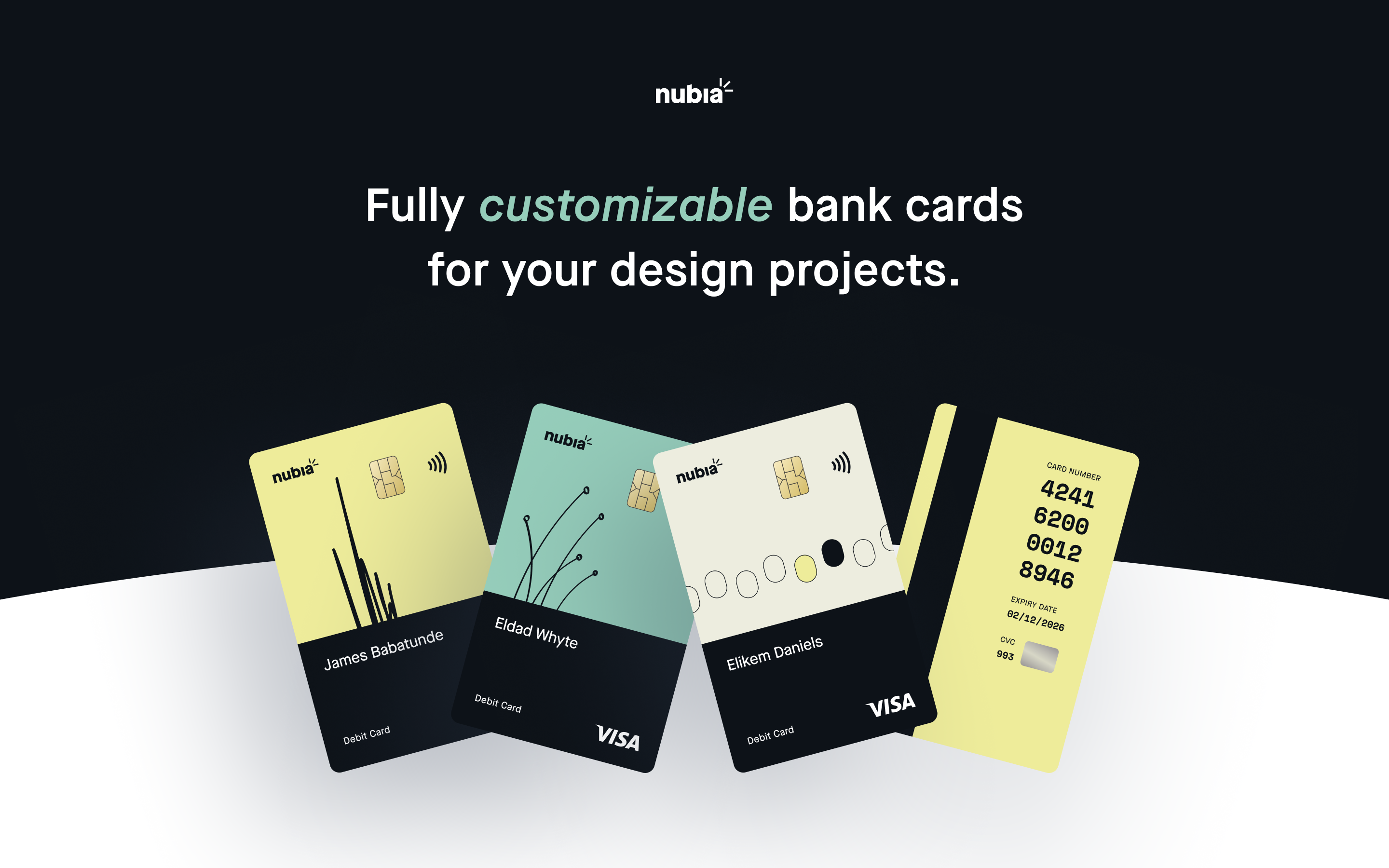
Using beautiful card mockups for a Fintech product has been the norm forever. Bank card templates in the community help you hit the ground running by changing the colors and text. As with 3D illustrations, mix and match various templates to create your unique card. Similar to the templates by Fons Mans, these cards are created on Figma using shadow and blur techniques. So you could also learn to create your cards for your future designs. We've picked a couple of resources with diverse styles and mockup options.
Some cool bank card templates:
• Cardy by Piqo and Soroush Nasrpour
• Nubia Bank Card by Elikem J. Daniels
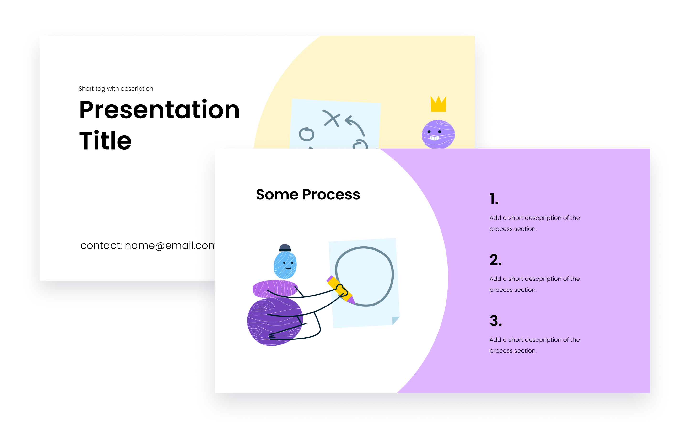
Got a presentation tomorrow and are not yet ready with the design? Choose the vibe you want to go with, download one of the excellent presentation deck templates from the community, replace the text, and you're done. Something that we liked about these templates is that they also come with illustrations that fit in the style of the deck - especially the one from Blush. Most of these presentations come with component support, so it should just be plug-and-play. We've picked a few templates that fit on different occasions.
Some deck templates:
• Vibrance by RRGraph - A professional presentation template
• Source of Truth Design Deck by Femke van Schoonhoven
• Deck Template by Blush - A more playful template
• Simple Slide Deck & Presentation by Sam Whiteman
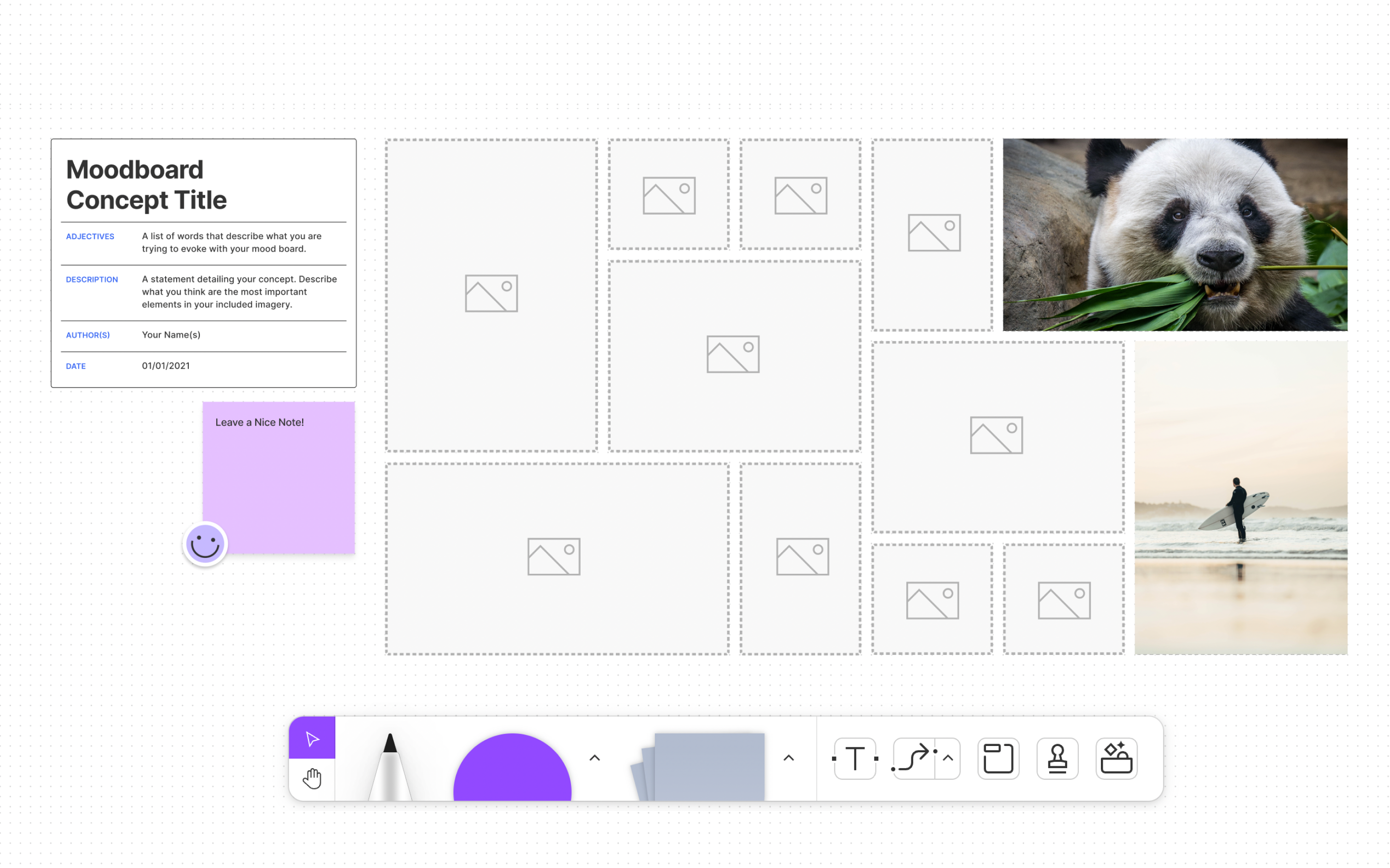
Moodboards form an essential part of the web design process for any UI designer. It sets the direction visually and brings all the stakeholders to the same page before the actual design phase starts. This official template from Figma features readymade layouts to create visual mood boards in a snap. Some people like their mood boards to be free-flowing rather than organized. But this template brings in a structure that is easy to consume for all the stakeholders, not only designers. Drag and drop images into the placeholders, and you're good to go. You can get this template here.
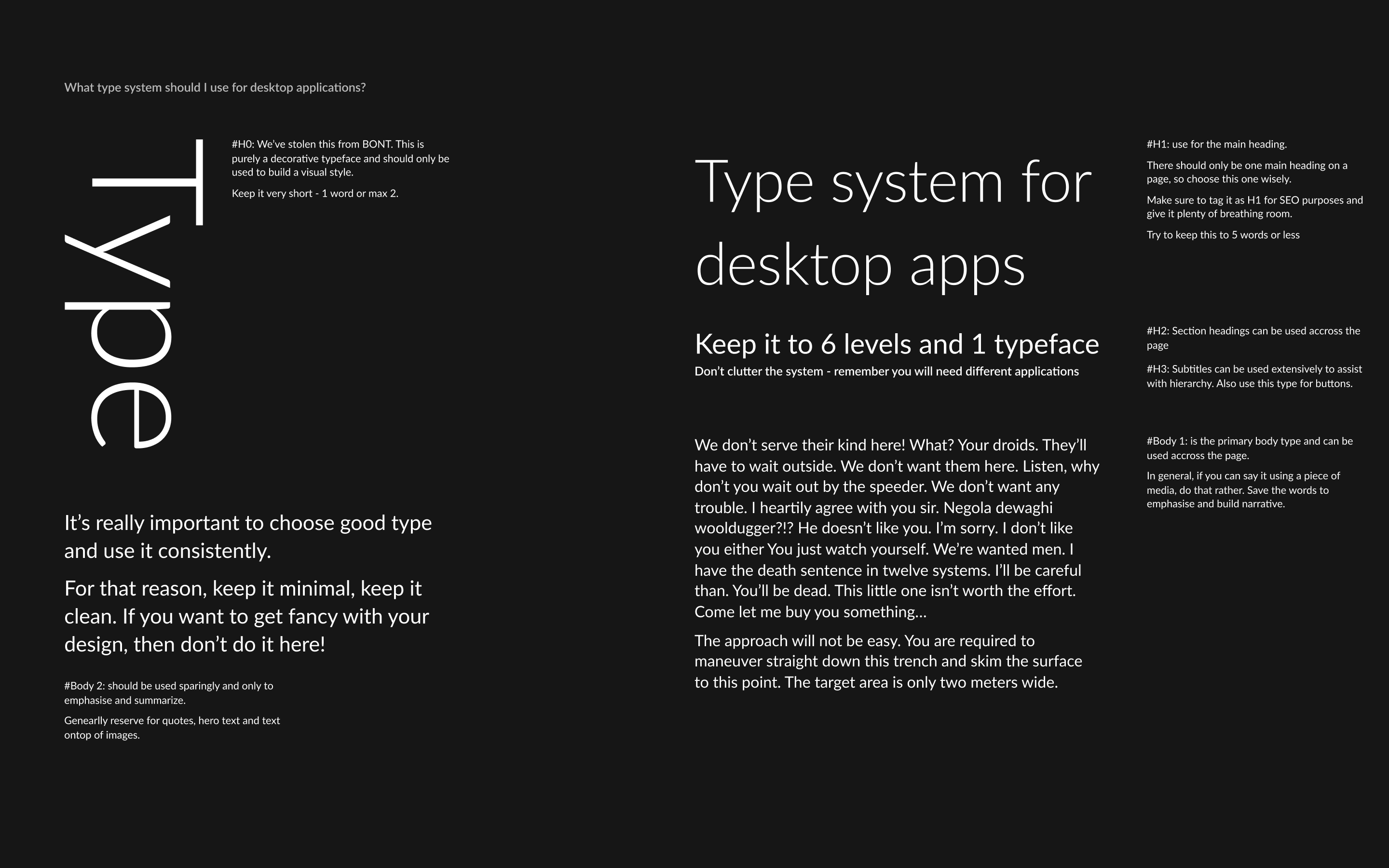
Once your mood board is created, you will have to draw inspiration from the mood board and create your style guide for your brand. There are several factors and points to include while creating a style guide. It has to be designed in a way that is scalable and easily editable in the future. These templates also have a page structure containing every aspect of a style guide, like iconography, illustrations style, colors, typography, etc., so you can build your styles on top of them. Since these also come with predefined styles, change the styles from the styles panel to establish your brand's style. We've collected a couple of templates for style guides. The first one, by Richard Dykes, covers the entire typography styles required for your brand. The next one by Tomasz Wieczorek has almost everything your brand needs - from colors to Social Media templates.
Some style guide templates
• Dark Design Guide Template by Richard Dykes
• Brand Style Guide Kit by Tomasz Wieczorek
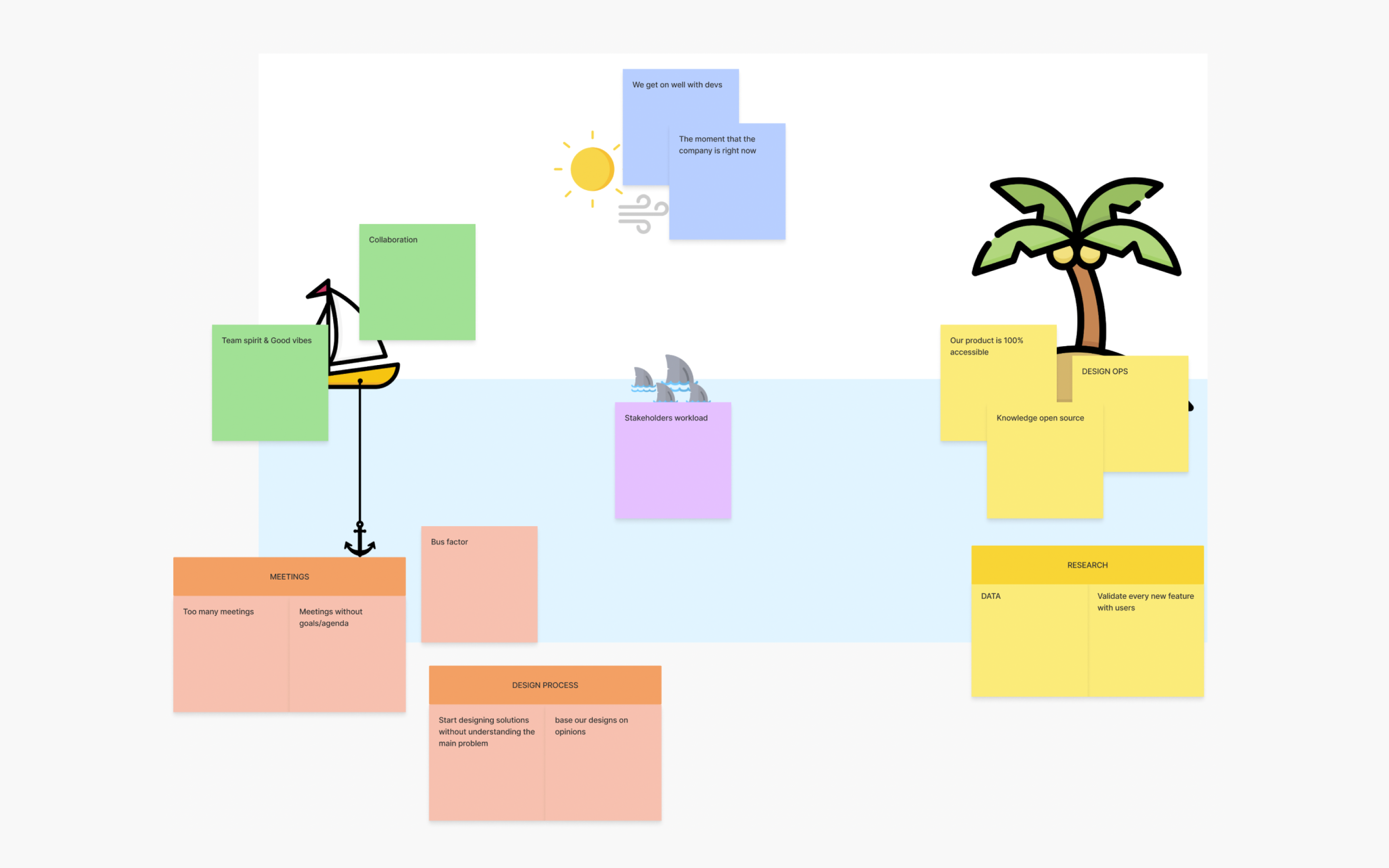
It's always good to look back at your progress every once in a while. These are called retrospectives. These help you to understand the problems the team has faced, the risks, strengths, and opportunities to be improved in the next sprint. The Island Retrospective Template helps you do precisely that. We went for this template primarily because it has a fun element rather than keeping the retrospective calls dry. It also has these sticky notes in place so, in the end, you can weave out the whole journey of the sprint as a fun story that everyone can relate to. You can download this template here.
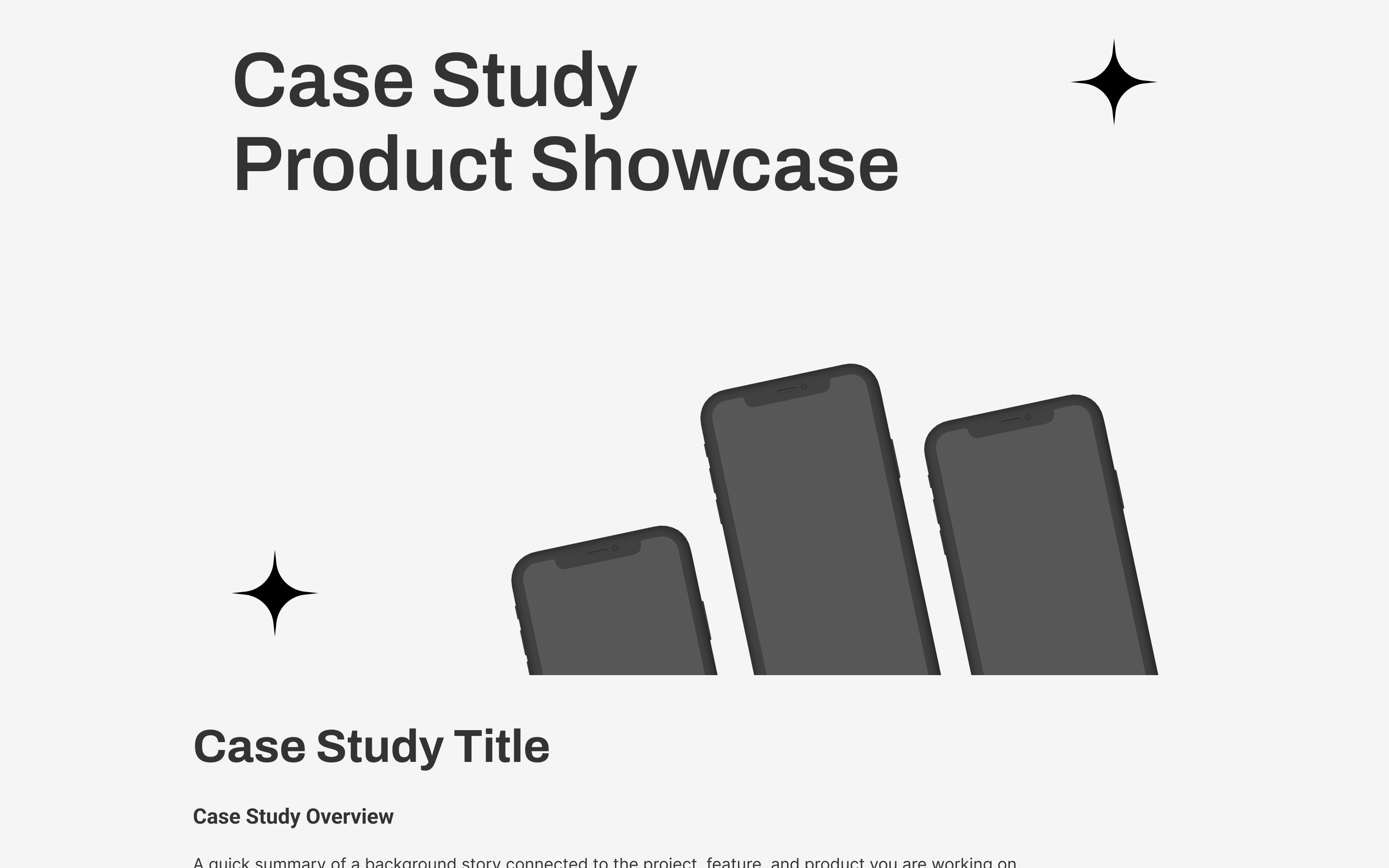
It is always a good practice to document your design work, and to do that in a visually attractive way is another topic. The Figma community has some excellent templates for you to get started. One of the major platforms to showcase your case studies is Behance, which was a primary criterion for choosing these templates. All these case studies fit the requirements for a Behance case study, so these can be exported and uploaded right after adding your content. Case study templates can also be used as a checklist to avoid showcasing certain aspects of your design.
Some case study templates
• Case Study Template by Putra
• UX Case Study Template by Isaar Tahir
• Behance Presentation Template by Agung Priowismawan
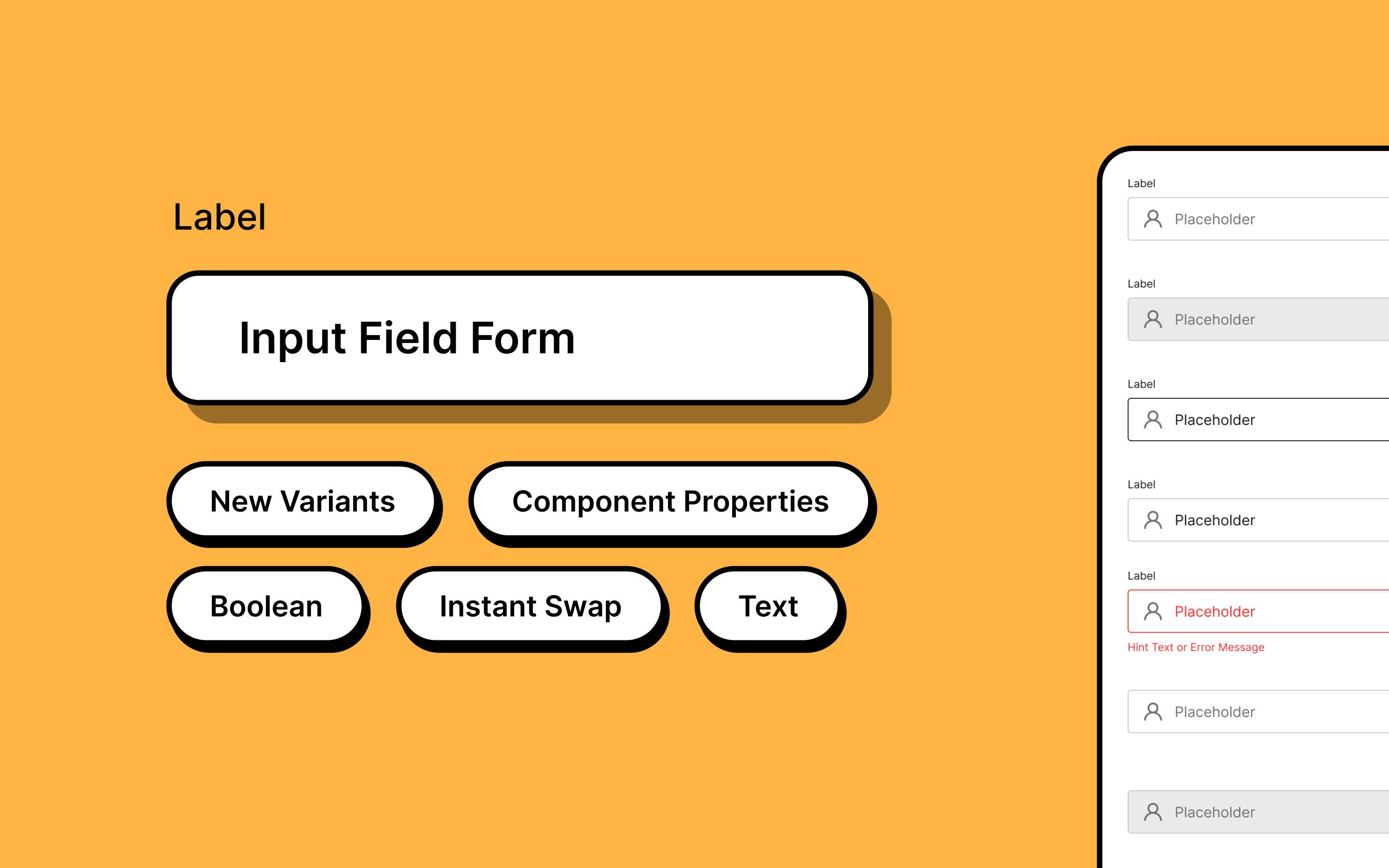
One of the most common components used in web design is the input field component. Whether you want the user to fill out a form, submit their mail ID for a newsletter, or log in, input fields take center stage. And as every component does, input fields also have several variants. So why not make use of this template by Shyam Shahu Shrestha? Just edit the properties of the predefined variants, publish this library to all the files, and you're good to go. We liked that this template uses the latest component property feature from Figma, which means fewer variants exist. You can get a copy of this template here.
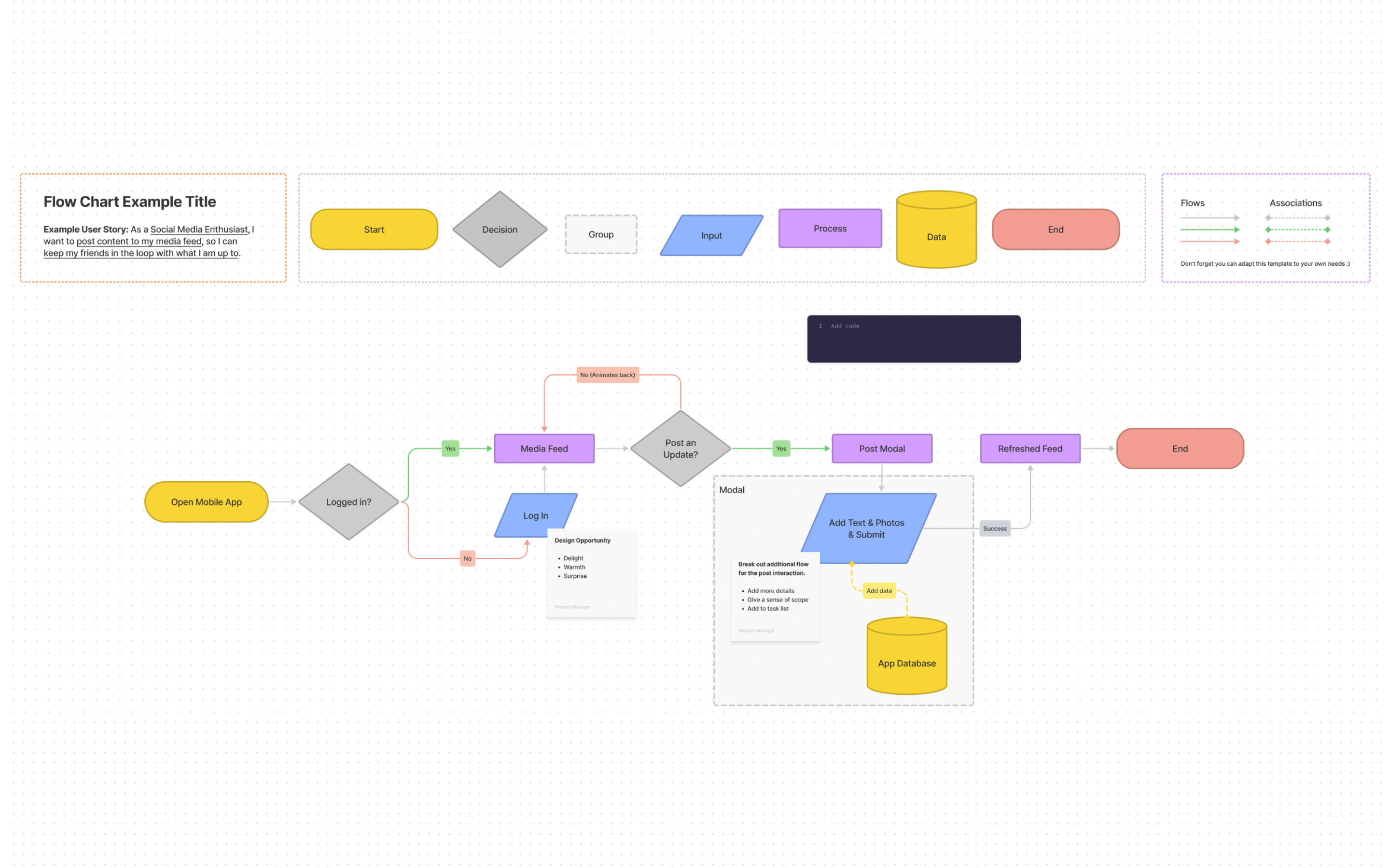
Flow charts form an essential part of the ideation phase. But the problem is that not every stakeholder understands what each flowchart block does. This Figjam flowchart template defines a legend for each shape, line, and arrow. And in addition to that, they also have a list of shortcuts to use on Figjam to create a flowchart. Download this template here.
Over time, Figma has become more than a tool for UI design. It is also a popular tool for designing graphics for social media. So, the community also has templates for Instagram carousel posts. Instagram supports two sizes for carousels - 1080x1080 and 1080x1350, both of which are available in the templates listed below. All these templates use the Figma auto layout feature and have multiple themes to choose from, so it is almost like anyone could edit these templates.
Some cool carousel templates
• Instagram Carousel by Viraj Aher
•


