

In the current tech scenario, one can't predict what device their user will use to interact with a product. This is why it's always a good idea to build something that supports all devices. However it is nearly impossible to design for every screen size with so many different ones launching every day.
What is the alternative? A Responsive and Scalable Grid, of course!
With a responsive grid, we can set guidelines for the layout to change based on the size of the screen. In this way, we guarantee that our designs will look seamless on existing screens and will be future-proof. What's more? A grid also creates a consistent layout and minimizes decision-making.
If Marilyn Monroe was a designer, the lyrics to the famous song would have been "Grids are a designer's best friend".
Let's find out how to build a responsive grid from scratch, with exact measurements and practical examples.
Grid Anatomy
Before we dig deeper let us go over some basic elements that help build a grid.
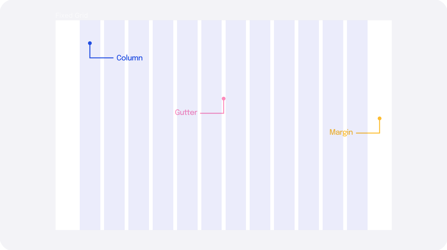
Columns: The vertical blocks on which you place your content. The column width can be fixed, or flexible, depending on the usage.
Gutters: The space between the columns.
Margins (outside gutters): The whitespace between the website content and the screen edge.
There are no hard and fast rules for the number of columns, gutters, and margins you set while creating a grid. The specs of the grid depend upon the project you are building. The columns can be far apart, or there can be no space at all, depending on the style and feel you prefer.
Types of Grids
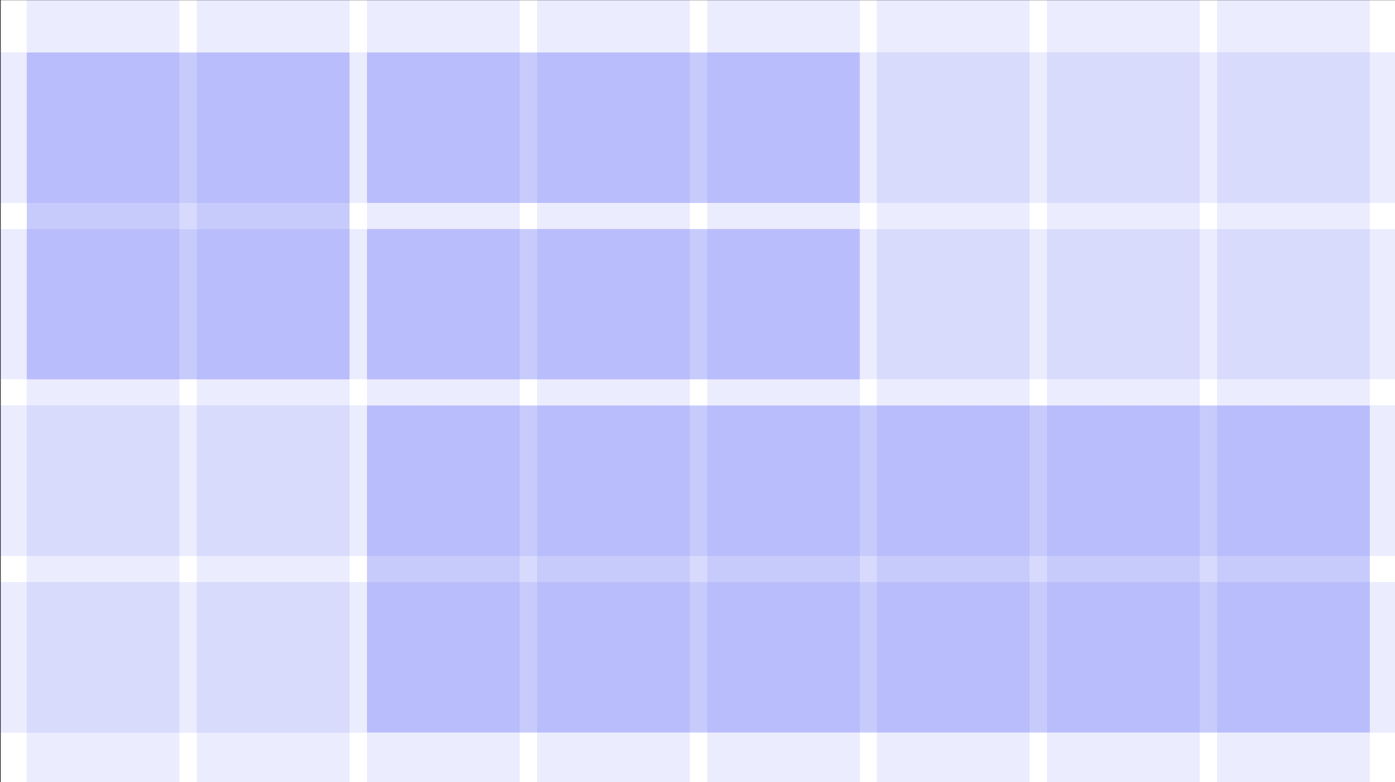
A responsive grid can either be Fluid or Fixed for each breakpoint. This influences how the content will scale with screen size.
Fixed Grid
In this grid, the maximum width of the content (column size) remains fixed. As the screen size changes, the margin size increases or decreases. The layout of the content changes only when the columns don't fit on the screen anymore.
A fixed grid works well when we have to control the max-width of the layout. It helps the content appear un-stretched on bigger screens.
Fluid grid
In this grid, the margin remains fixed, and the column size scales with the browser width. This utilizes the available screen space although the elements may appear stretched out. The layout of the content changes with the screen size. Fluid grids work well when we cater to many screen sizes in a given breakpoint range.
Tip: It is best to set the grid to fixed for desktop, and fluid for tablets and phone
Building the Grid
Step 1: Deciding the breakpoints
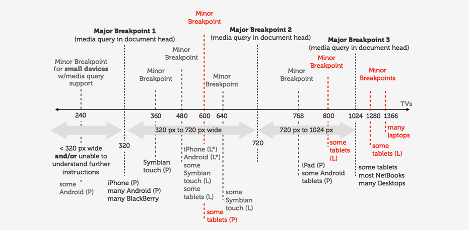
As the size of the device or the browser width changes, the content of the page adjusts to fit the best possible layout. Breakpoints have a minimum width attribute. This means the screen size between two breakpoints will inherit the dimensions of the smaller breakpoint. To ensure that the design is consistent throughout the devices, we should design for at least three breakpoints.
Set the breakpoints to 360px, 720px, and 1280px. This gives us the following ranges:
Mobile: 360px - 720px
Tablet: 720px - 1280px
Desktop: 1280px +
Step 2: Adding Frames/Artboard
In Figma (or any other tool of your preference) add a frame for each device. The device dimensions should sit between the breakpoints selected. Here, I have chosen from the Figma preset frames.
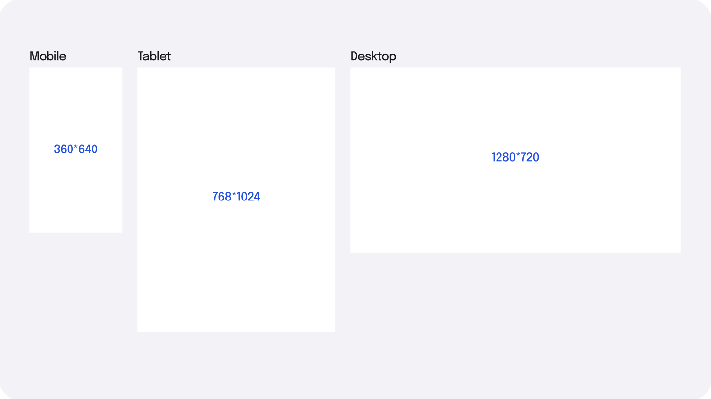
Mobile: 360 * 640
Tablet: 768 * 1280
Desktop: 1280 * 720
Step 3: Adding the Grid
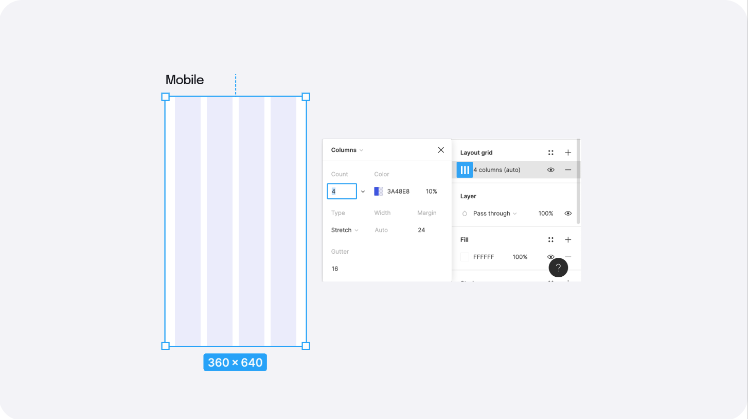
Mobile
Select your mobile frame, and add a column grid. Set the number of columns to 4, gutter to 16, and margin to 24. The column width is automatically set to auto, which means the grid is fluid.
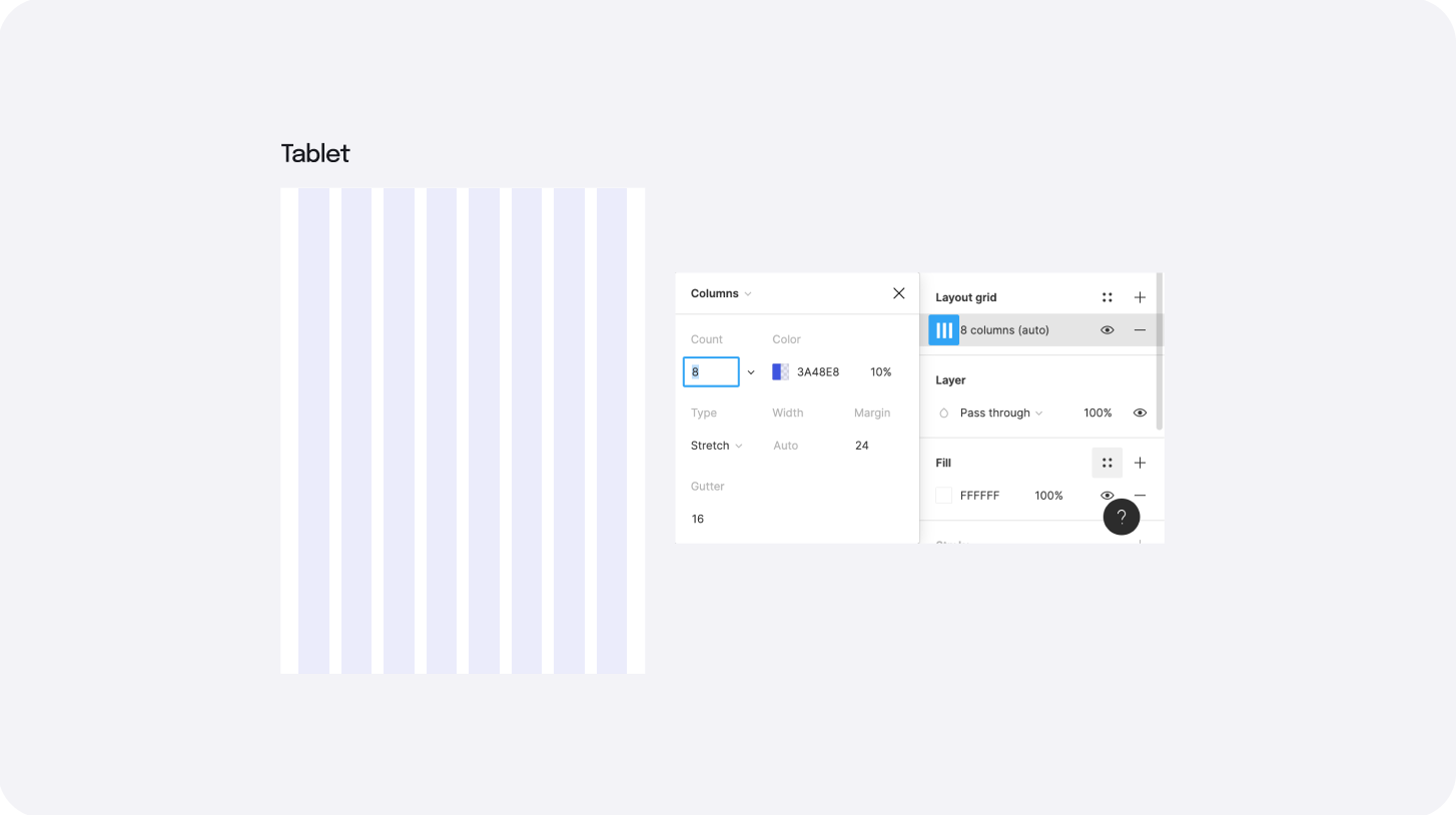
Tablet
Similarly, add a grid to tablet with the same values, except increase the number of columns from 4 to 8. Adding more columns gives more layout options on a bigger screen so that the content doesn't look very stretched out.
Desktop
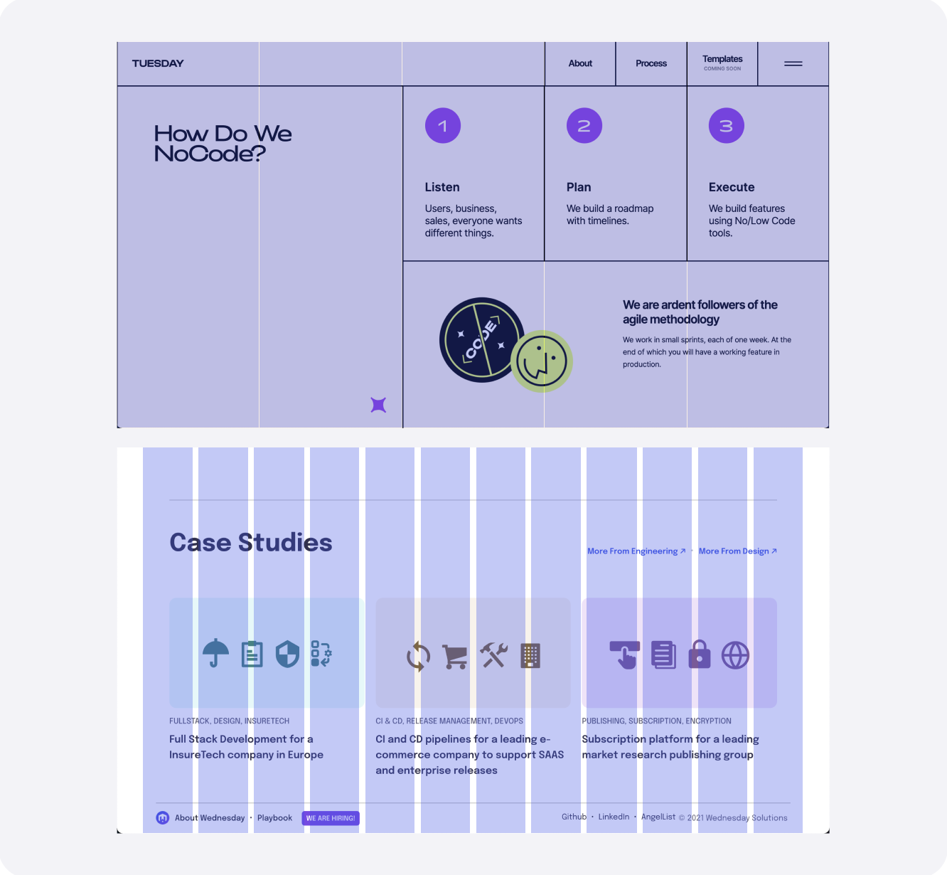
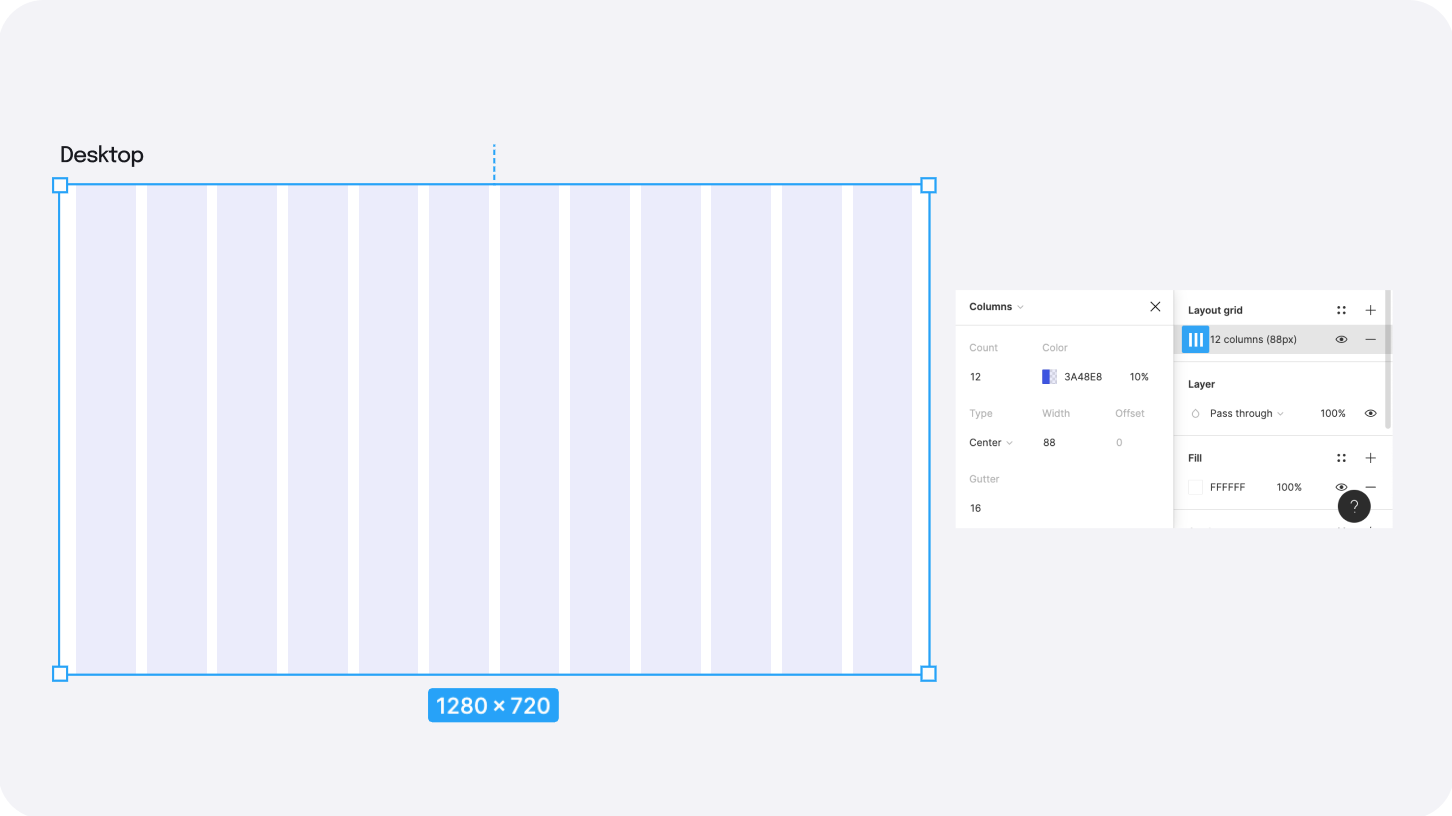
As mentioned earlier, it is best to switch to fixed grid when designing for desktops. To do this, add a column grid to your desktop frame, and switch the 'Type' from 'stretch' to 'center'. This disables the margin, and allows you to add a column width.
Set the column width to 80px, gutter to 16px (again) and increase the number of columns to 12. 12 columns gives a lot of flexibility to create different layouts, as they can be divided into equal groups of 6, 4, or 3, or different groups such as 3-6-3, 2-8-2.
For web apps, we recommend to set a fluid grid up to 1440px, as one can not always afford to lose the extra margin/whitespace that comes with fixed grids. However, above 1440px, it is best to switch to fixed, as the content may start appearing very stretched out.
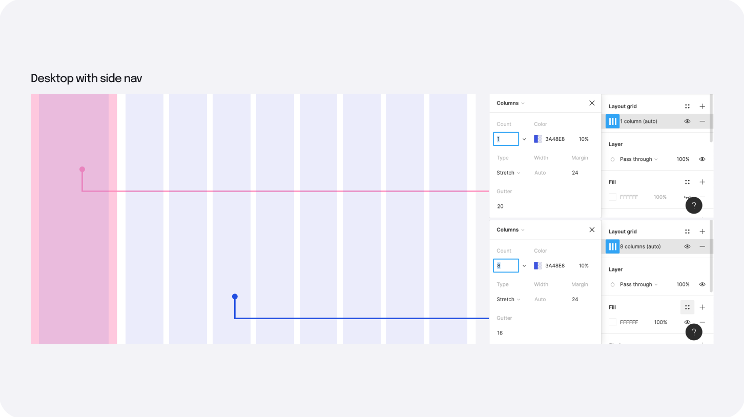
Desktop with Side Navigation
To create a grid with side navigation, you need to divide the grid into two — one for the side nav, another one for the content area.
Side Nav: Start by adding a frame inside the desktop frame of say 248px which will be your side nav. Add a layout grid with 1 column and margins of 24px.
Content Area: Add another frame for the remaining space on the main frame. Since our content area is 1032px, we will add the same grid we used for tablet (700-1280).
Set the horizontal constraints of the content area to 'left and right', this will allow you to scale the main frame with the content area.
Using the Grid
A grid is a guide that helps us set the base while designing. Here's a list of a few things to keep in mind while designing with your grid.
- All your content should always wrap inside a container. These containers can be visible with clear borders (cards and modals) or be invisible for layouts with only text and icons.
- The containers should always span from the outer edges of the columns they sit on, and should not bleed into the gutter.
- The elements inside the containers don't necessarily have to abide by the grid. These can be aligned as per the padding of their parent containers.
- Images, illustrations, and hero images can bleed out of the grid and scale regardless of whether the grid is fixed or fluid.
- When designing with a grid in Figma, set horizontal constraints to your parent container for it to behave responsively with the grid. The constraints are 'Centre' for the fixed grid and 'Left-and-right' for fluid grids.
Now that we have built the grid, add your content with appropriate layout constraints, and resize the frame to see the grid in action. Let's see how a breakpoint plugin influences how the grid would work for different devices.
Conclusion
With responsive grids, we can control how our designs will look on any device. Grids don't have to follow the same measurements. They are completely dependent on individual projects. The number of columns, gutters, and margin widths is a design decision needed before starting a project.
Once the grid is established, they act as guidelines and aren't set in stone. There is nothing wrong with breaking the grid to make something stand out, or as the clients would say, "make it pop!" - as long as it is a conscious decision.
“The grid system is an aid, not a guarantee. It permits several possible uses and each designer can look for a solution appropriate to his style. But one must learn how to use the grid; it is an art that requires practice.” - Josef Muller-Brockmann
Enjoyed this article? Don't miss out on more exclusive insights and real-life digital product stories at LeadReads. Read by Top C Execs.
Join here.
What next?
Learn how to use responsive grids hands-on with the help of our free Figma Responsive Grid file. It has different grid layouts and content constraints set up. You can also use it as a grid library to ease your design process.
Thoughts or Questions? Please leave a tweet on our Twitter handle.