Figma is an incredible collaborative design tool that aims to be your one-stop shop for designing user interfaces/experiences. It has features like real-time collaboration, dynamic layouts, and responsive previews. However, despite all its great features, add ons are never a bad thing! Fortunately, there are some amazing third-party plugins that will help you get more out of your design process with Figma.
In this article, we will look at some of the best plugins that you can use with Figma. There are many plugins available, but here we will go through the top 20 plugins to use with Figma and why you should use them.
Using plugins in Figma
Add new plugins
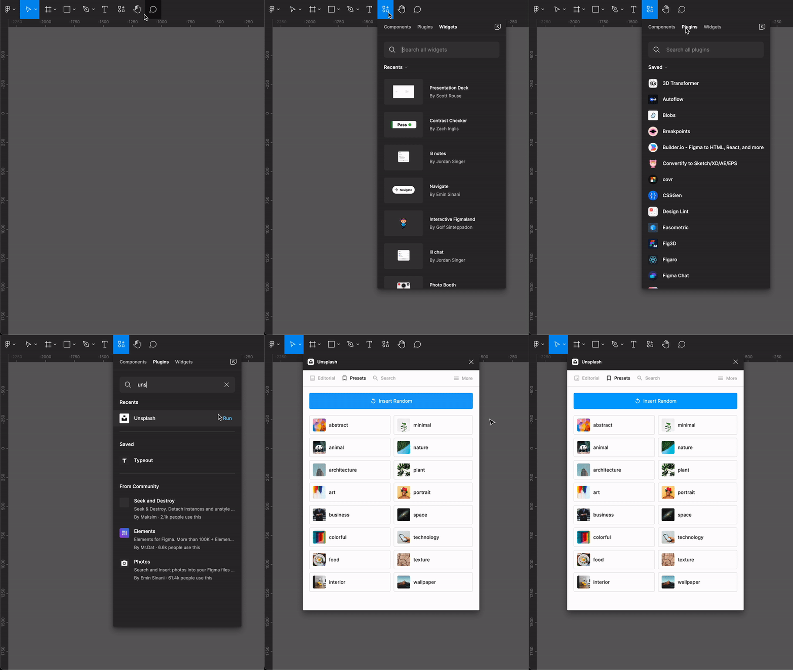
You can directly run plugins without installing them by following these simple steps:
• Select Resources in the nav bar or use the shortcut Shift + I
• Select the plugin option and search for your desired plugin
• Hover over the plugin in the search results, and click Run
View more details of a plugin
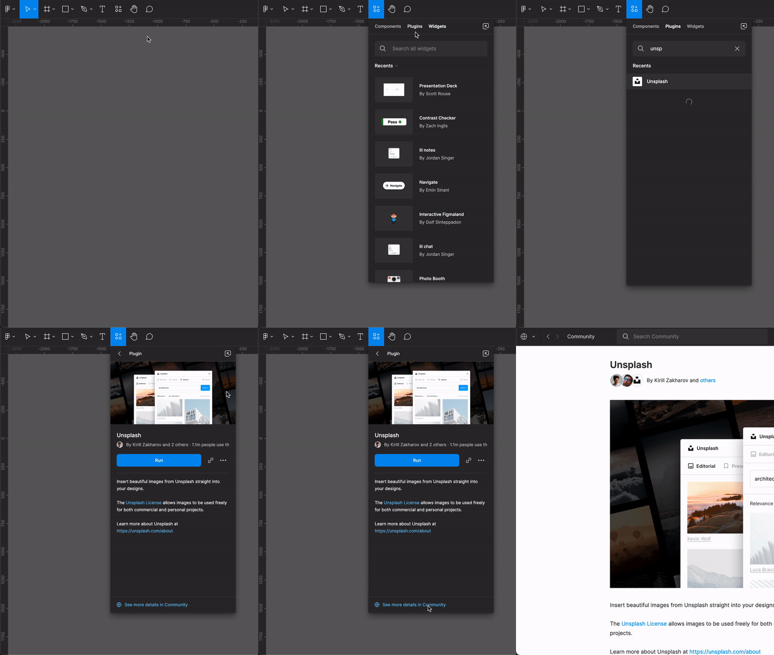
You can learn more about the plugin, such as the creator, description, version updates, and the no. of users who use the plugin with the following steps:
• Select Resources in the nav bar or use the shortcut Shift + I
• Select the plugin option and search for your desired plugin
• Select a plugin from the search results
• Click on See more details in community
Save Plugins
Save your most used plugins so they are easily accessible
• Select Resources in the nav bar or use the shortcut Shift + I
• In the resources panel, select the plugin option and search for your desired plugin
• Select a plugin from the search results
• Click on More options > Save
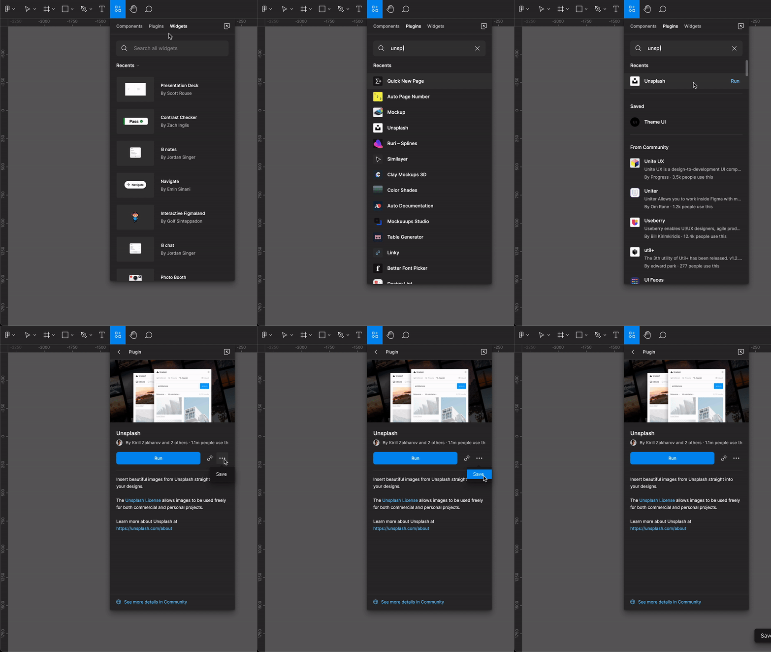
Once you have a saved plugin you can run it via Figma’s quick action shortcut as well. All you need to do is hit Command + ’ to open the quick action tab and search for your plugin.
To learn more about how to use plugins you can check out Figma’s official blog.
Now without any further ado let’s check out some of the best Figma plugins that will supercharge your workflow.
List of Plugins
Click on any plugin from the list below to read more about it:

Unsplash is no stranger. You can use it to add beautiful, high-resolution photographs to your designs. The Unsplash plugin helps you accomplish the same thing without switching between your applications. Additionally, you have the option to add random images from a category, which can save you time exploring. Also, the ability to add multiple images at once makes it a powerful plugin
Enjoying this article? Don't miss out on more exclusive insights and real-life digital product stories at LeadReads. Read by Top C Execs.
Join here.
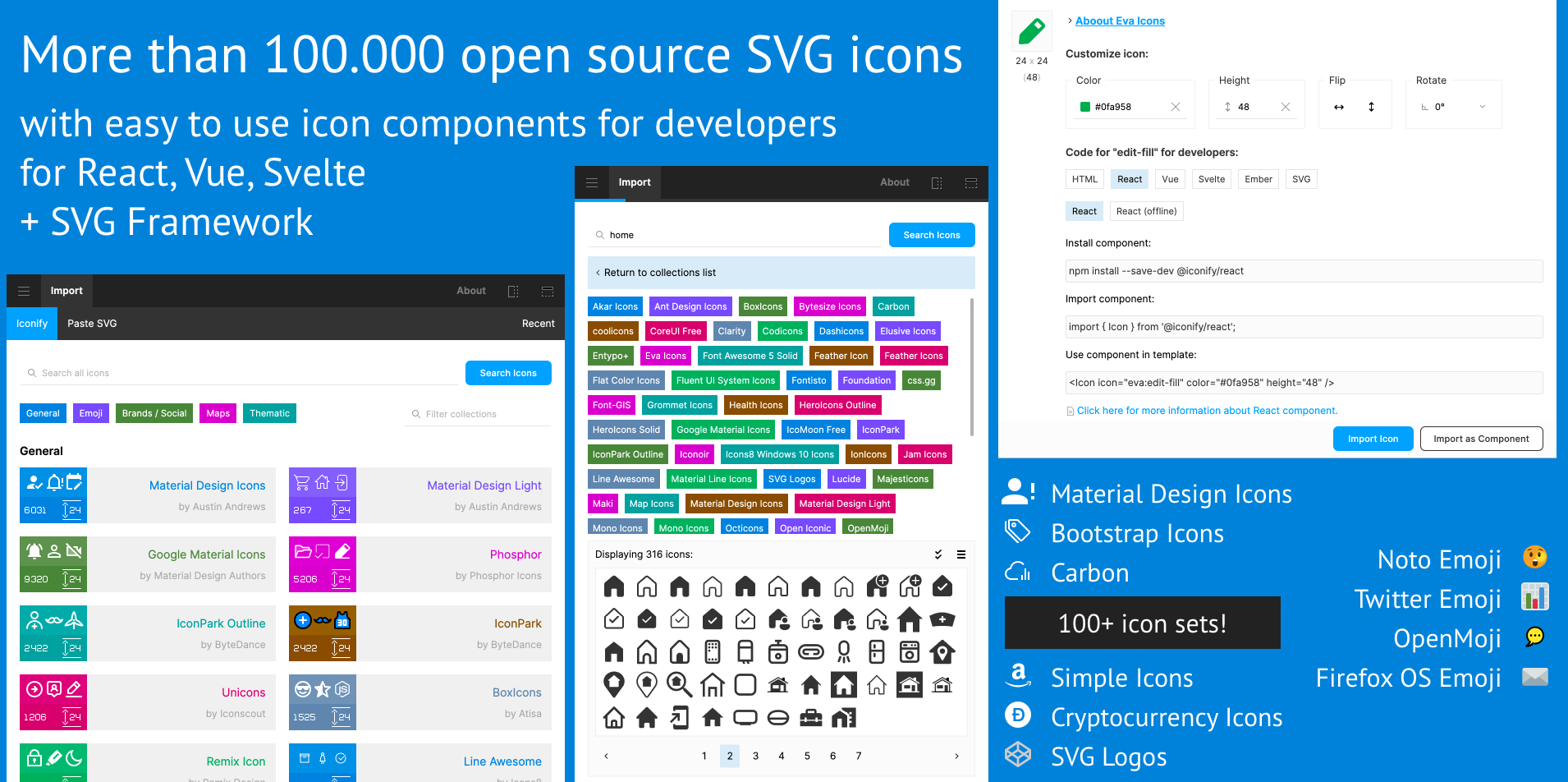
All of the icons from more than 100 icon sets can be found in one place. Despite not having the most attractive user interface, Iconify does a great job of its task. Additionally, it allows you to import SVG icons directly as components, saving you a lot of hassle.
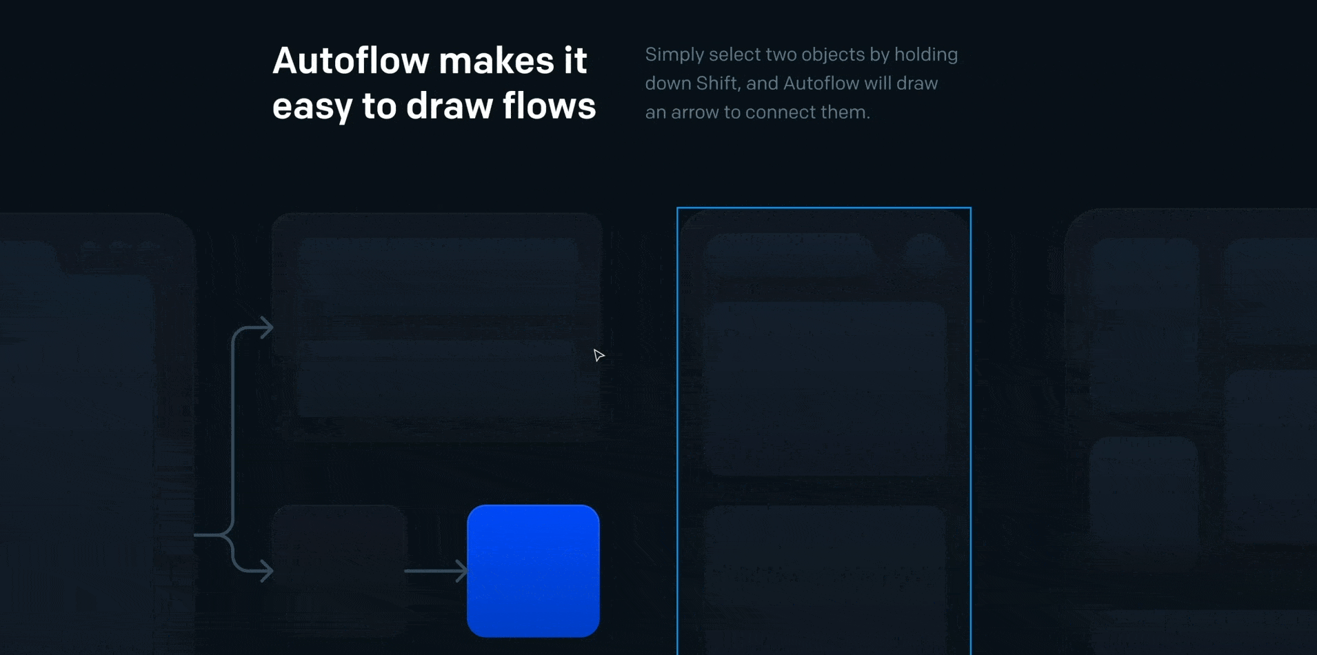
This plugin is sure to gain you brownie points from your project managers, developers, and other stakeholders. With Autoflow, you can connect different frames using arrows showing the next screens. This makes it easier to see the flows right on the canvas.
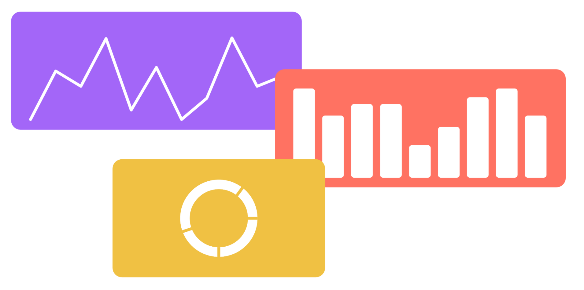
Nobody forewarned us that we would be making so many charts in our role as designers. Fortunately, you can speed up your job with various chart plugins that are widely available. Charts is one of the ones I use the most. It offers a wide variety of alternatives and is free. Although you cannot input actual data, it can help you get speedy approvals during wire-framing.
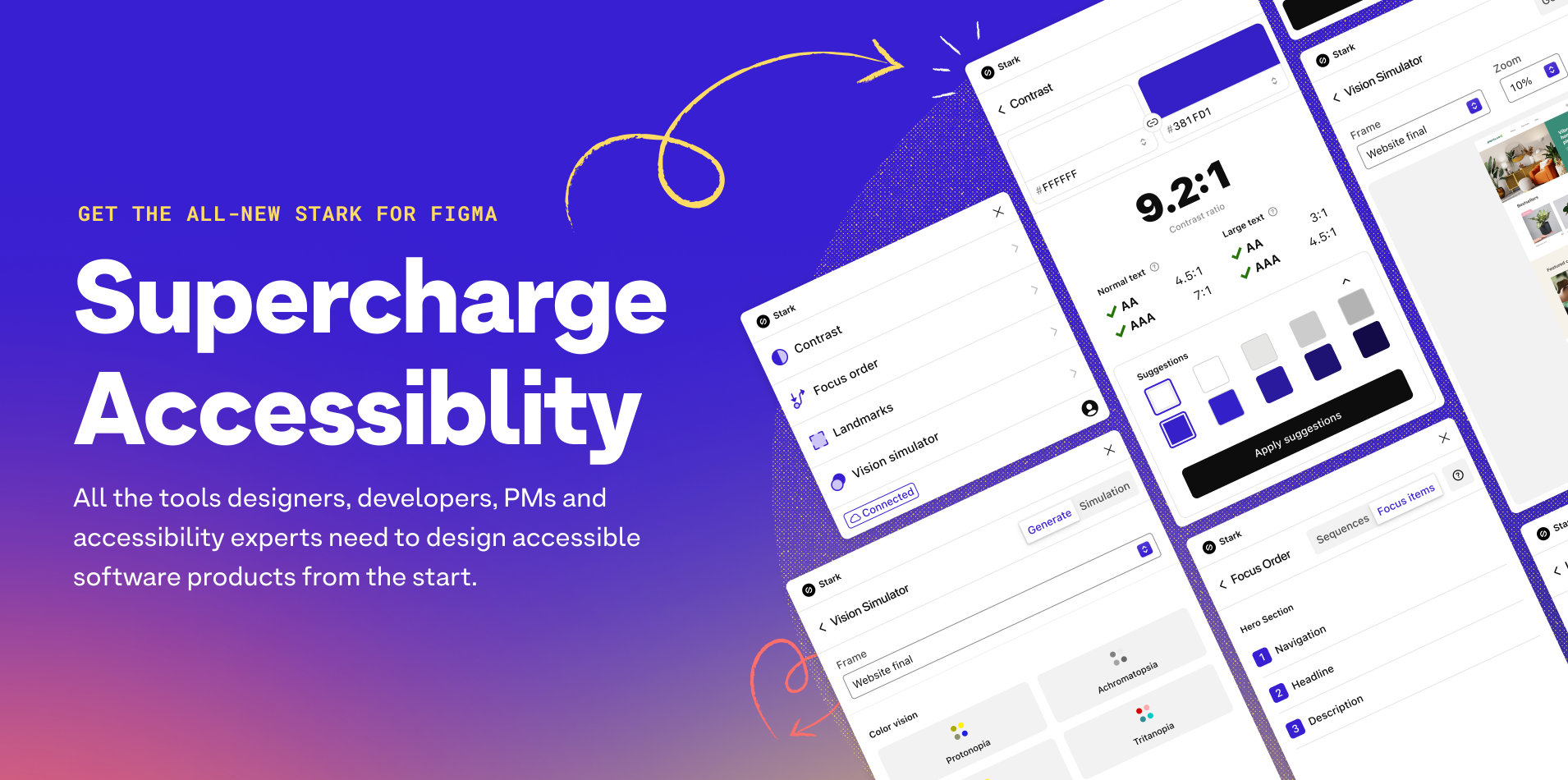
To create a product that is truly accessible, Stark is a fantastic plugin. It includes numerous features that can help you ensure that your product is usable by everyone. However, only paid users may use most of the functionality. Personally, I use it to check the text's colour contrast.

Which plugin would you choose if you could only have one? Design lint would be my immediate answer. This plugin scans your file across all layers to identify all the styles that are missing from your style guide. You can quickly fix multiple inaccuracies with only a few clicks. Thereby saving you time and making it easier to produce consistent designs.
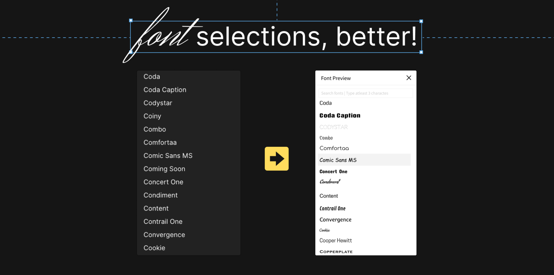
Figma does not preview the font style with the font name. When selecting a typeface, there is a lot of guesswork involved. Fortunately, the Better Font Picker plugin allows you to preview while scrolling through the typefaces. This helps you to choose the finest alternative without having to recall font names or experiment.
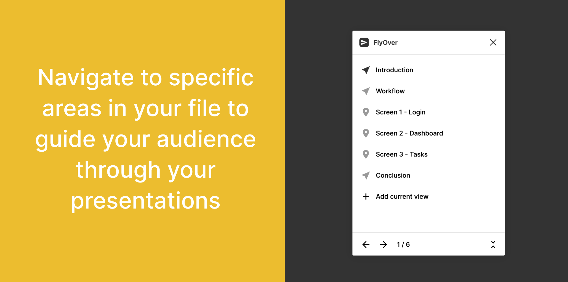
Ever so often, we all share screens and present our designs. Even while we would want to show only the prototypes, we are all aware that there are times when you need everyone's eyes on the canvas. Regardless of how well we name the sections, we still need to scroll to find the right frame. With the help of Flyover, you can bookmark the key sections/frames and aesthetically navigate to them, without performing the nervous cursor dance.
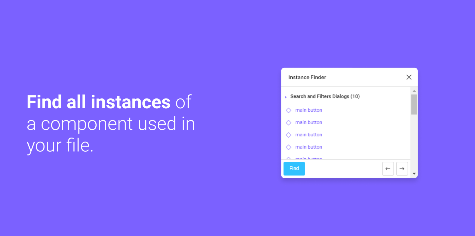
A feature that should have been in-built, but isn’t. We periodically need to organise the components in our design file. However, not knowing how it will affect the instances in the file poses issues. With the aid of Instance Finder, you can view all the instances of a component. This can help you decide how you wish to tweak the underlying component.

This was the most frequently mentioned plugin when I asked my UI fanatic teammates which plugin they couldn't live without. With Remove BG, you can easily remove the background from any image to match the aesthetics of your UI.
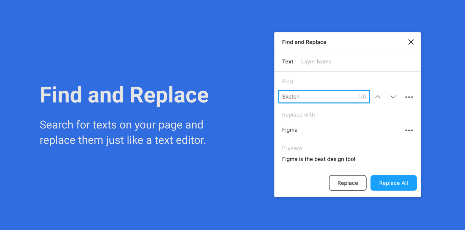
One fine day, the business team drops a “Hey, let’s change all the ‘blues’ to ‘bloos’, it's more user-friendly.” Fireworks go off, and everyone is ecstatic, but you. It slowly dawns over you, that you’re going to have to make this replacement on over 70 screens and God forbid, you miss that one ‘blue’. The Find and Replace plugin is your saviour. Like any text editor, search for your keyword, click ‘Replace All’, and celebrate with your team on the groundbreaking idea.
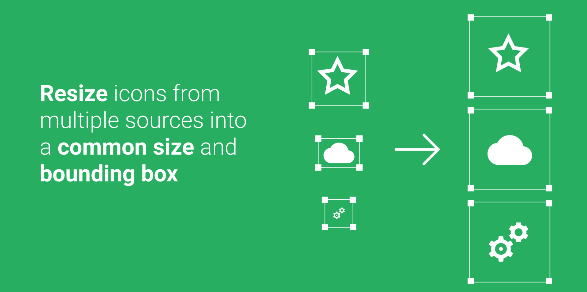
Because we swap icons according to requirements, it's essential that they are all the same size so that our designs don't vary with each swap. While the bounding box size needs to be the same pixel-wise, the icons need to appear the same visually. Icon Resizer ensures both are accurate.

As designers, we are constantly on the lookout to make our products more visually appealing and exciting. LottieFiles is a great way to add just that bit of zest your product is lacking. You can browse hundreds of cool animations, throw in your colours, change the speed, and export it as GIFs or JSON files. What’s even better you ask? With the Figma plugin, you need never leave your file! You can now browse, categorise and import files using your Lottie account between Figma and their website seamlessly.
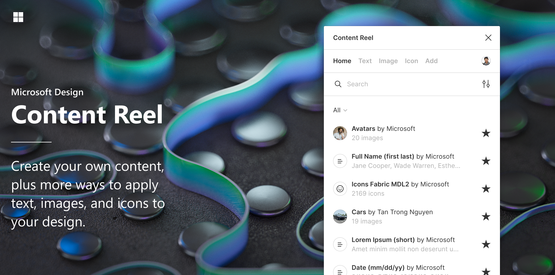
When you’re designing products, it is important that the content makes sense to other stakeholders in order for them to fully visualise the flow. With Content Reel, you can save the actual data and use it throughout your designs. This will help you make your designs self-explanatory and consistent (data-wise), and add extra finesse to your designs.
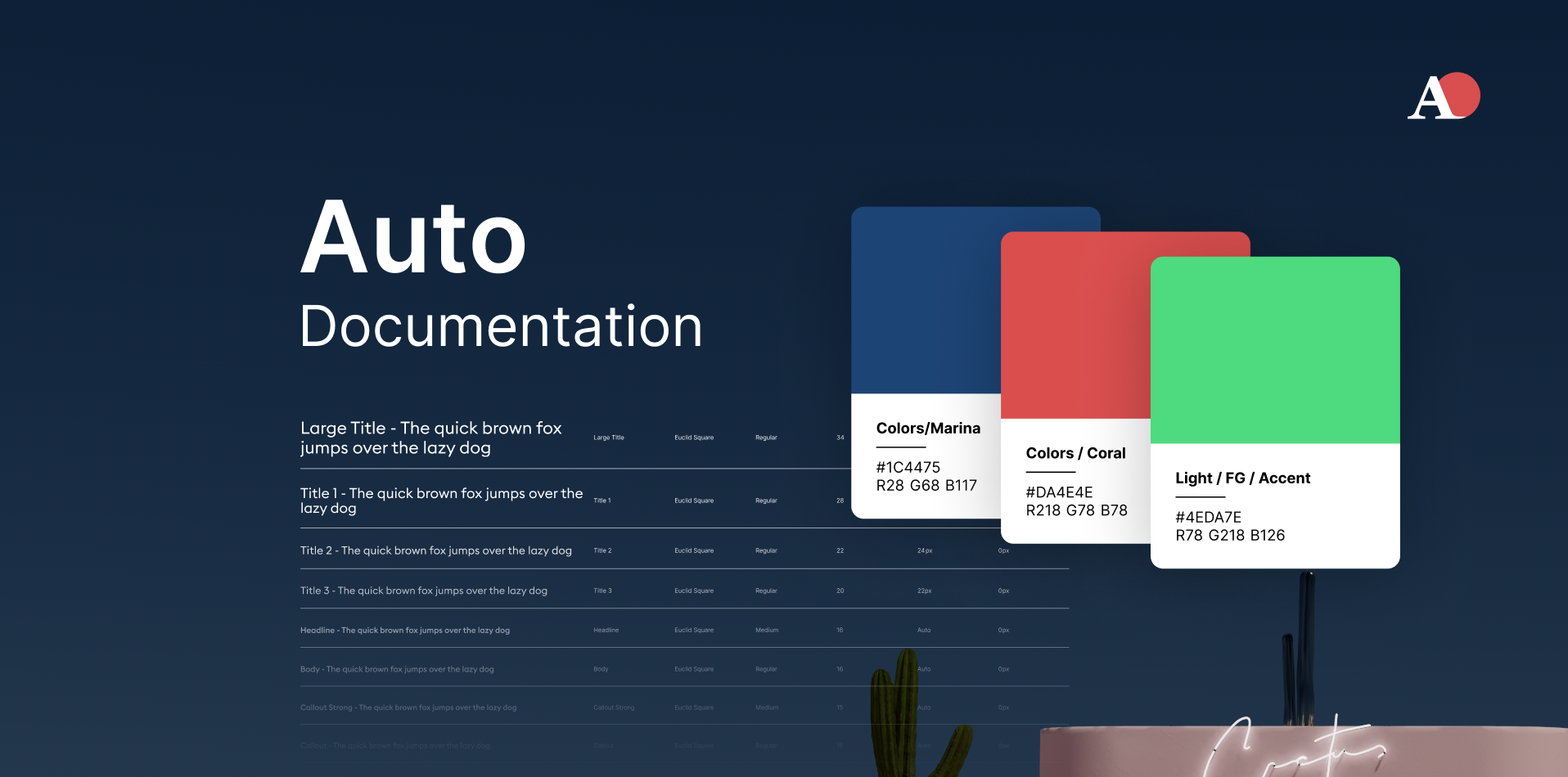
Our lives are so much easier as Figma allows us to add styles to our files. However, we still need a visual document to share with other stakeholders. This calls for a great deal of extra effort. With just two clicks, Auto documentation creates this document from what is added to your style guide. The nicest feature is that it generates components that let you customise the layout to your preferences!
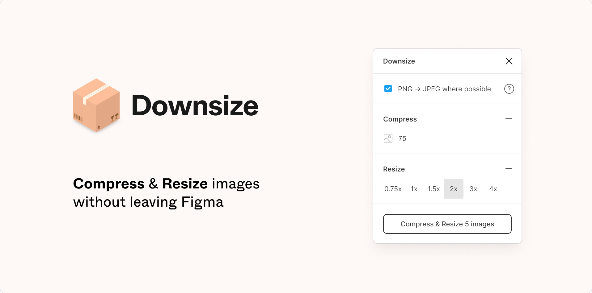
The frustration of sluggish and laggy files is ineffable. However, Downsize can be used to make this better. It compresses all the images on your file (or the ones you choose) without sacrificing quality. As a result, your file becomes lighter and faster.
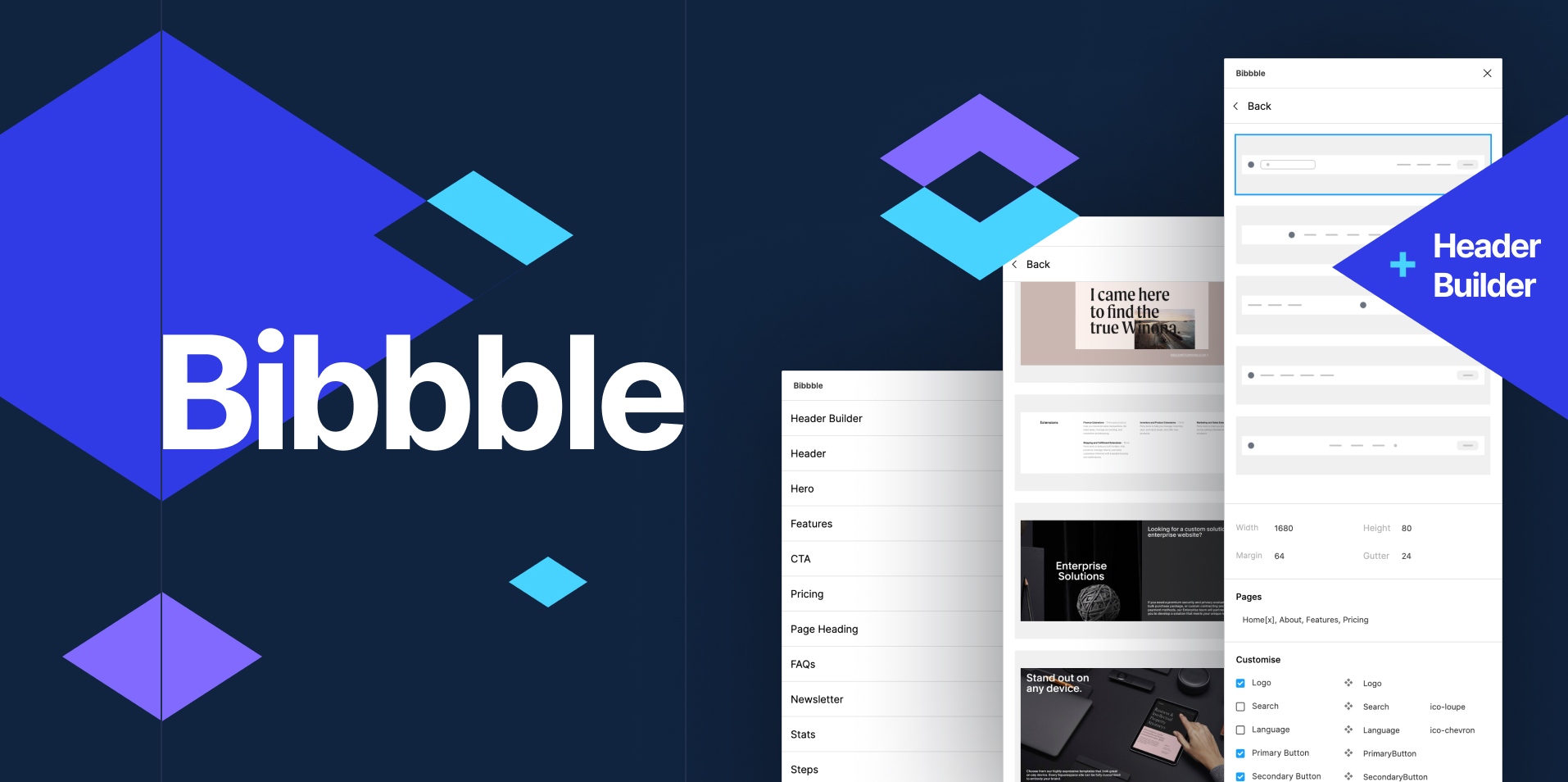
If you’re anything like me, you sometimes need to search for “inspiration” even for the most common layouts. As common as a blog section. Bibbble has a collection of screenshots of different sections from real websites that you can use for inspiration.
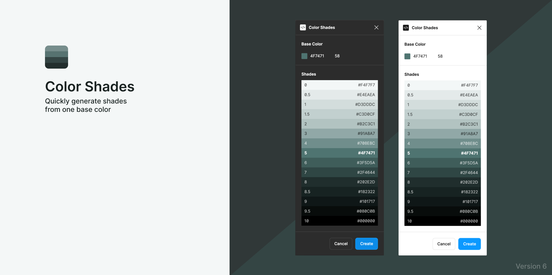
With the help of Color Shades, you can create various tones of your base colour. It shouldn't be necessary to stress the number of hours that designers can save by using this. You know you need it. Period.

What do you do when you have to change an instance to another or change the border radius of a card throughout? You multi-select. But what happens when they are scattered throughout the page and all nested within layers? With Similayer you can select a layer, and find all the other layers based on a similarity you choose. This makes it incredibly simple to make changes throughout the page in very less time.
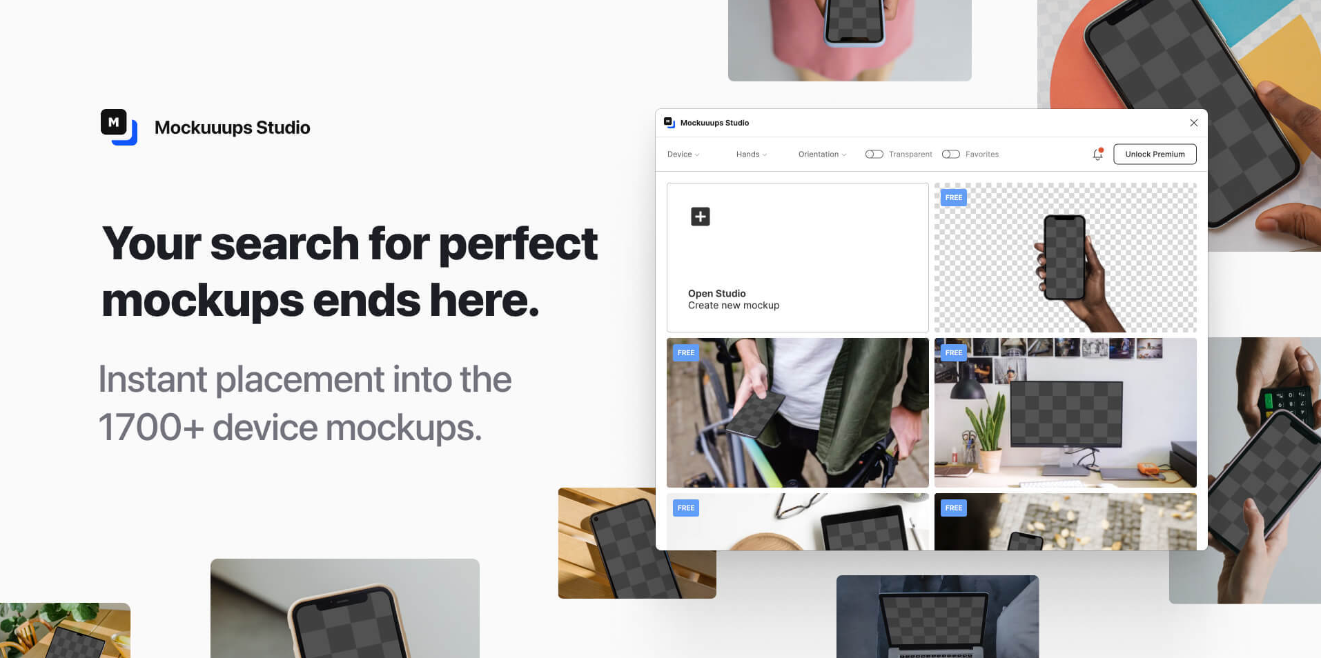
Creating mockups is an essential step in the design process Designers are accustomed to viewing digital versions of files and understanding how they will appear in the final output. But, not all stakeholders are adept at doing so. You may help them see your vision using real-life mockups. Mockuuups Studio provides a great variety of mockups, at a very reasonable price.
Where to go from here
By adding the right plugins to your workflow, your design process can be even more powerful. There are over 500 plugins and it is only increasing. These were just some of the plugins we use at Wednesday to make our workflow seamless and more efficient. With different needs, we are on a constant lookout for better, more powerful plugins. At this point, we believe there is a plugin for almost all your needs. It may not be exactly what you’re looking for, but close.
So if you work with Figma, make sure to check out our top favourites to make your design process easier. Also, don't forget to browse through the community to find something for your specific need. If you’d like to discuss more about Figma or need help with a design project, book a call with us or reach out via email.


