Designing a user interface with animations and transitions in mind is a great way to plan a better user experience (UX) for your next app. Animated micro-interactions are the perfect way to stimulate user engagement, in a world of short attention spans. This is why Airbnb recently introduced Lottie – it's a “new open-source tool that makes adding animation to native apps a snap.”
Projects like Lottie show the increasing importance of adding motion as a new element for crafting enhanced UX for both apps and websites. Like everything that is put into the interface and the process of interaction with it, animations must be a functional element, not just a decor. Animation in UI should adhere to a thoughtful approach and always needs to have a clear purpose set behind it. The experience for users is much smoother when the animation feels like icing on the cake as opposed to just a fly in the ointment.
Principle is a fantastic tool to make your UI interaction ideas come to life. The interface is Mac-friendly and was built to work seamlessly with your Sketch and Figma files. Principle automates most of the animation and transition effects for you. All you need to do is apply a trigger to a shape on one artboard, and change any property for the elements you want to animate on the final artboard.
You can download a free Principle trial here.
In this tutorial, you are going to learn 5 easy and highly effective UI animation techniques using Principle for Mac. After you’ve gone through this guide, you’ll be able to turn dull and static mockups into an interactive prototype with subtle interactions that delight users.
These will be the interactive animations we will be covering:
- Horizontal Parallax Scroll Effect
- Animated Search Bar Interaction
- Submit Button Splash Message
- Pagination Animation between Sections
- Expand Cards with a Sticky Element
1. Horizontal Parallax Scroll Effect
Parallax effects can be used for both vertical and horizontal sections in digital design. A few decades after it was first introduced in video games, the parallax effect made its way into web design, and then gradually into mobile apps, using static or slow-moving background images against faster-moving foreground images to create a multi-layered 3D scrolling feature. This made for a much more immersive user experience, captivating users with its subtleties.
Why this adds a wow factor -
- Digital screens may be a two-dimensional space, but designers can get creative and sculpt their flat pixels into having a sense of depth and dimensionality. This is where subtle parallax effects can come into play.
- Parallax scrolling effects add action and the illusion of depth by taking different visual elements and moving them at different speeds in an interface design.
Let's go over two examples of parallax scroll effects designed in Principle. You can find the downloadable files for these interactions attached with the examples.
1. Weapon Cards for a Mobile Game
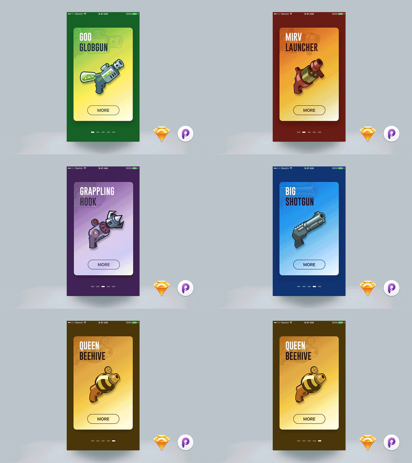
One of the most optimal places for parallax effects is while scrolling through cards or sections vertically or horizontally on a mobile app or website. The most fluid part of the experience is felt on the last card or section, similar to the rubber band effect that Apple introduced when you scroll to the end of a particular list.
You can find the downloadable Principle file for this interaction here.
2. Nike App Promotional Cards

This is an example of the parallax scroll effect created for a Nike app concept for promoting upcoming product launches. The design takes it up one level by bringing out the foreground elements - the shoes, to expand beyond the edges of the background cards. This effect is complemented by the background color change that happens in conjunction with the scroll.
You can find the downloadable Principle file for this interaction here.
As you might have seen from the examples, well-crafted parallax effects interactions can easily help you stand out from the crowd and create a lasting impression for your visitors. Do not think of parallax as purely decorative. Similar to any other technique you use, it should be incorporated in a way that adds real value to your visitors.
However, note that too much movement within parallax effects can cause harm for those with vestibular disorders. The illusion of movement and depth can cause dizziness or disorientation. If you do use these designs as inspiration for your own, remember to follow some of these guidelines for accessible parallax effect design:
- Keep the number of parallax effects to a minimum.
- Constraint movement effects within a small area of the screen.
- Don't let your effects distract users from important information.
Moving on to the next interaction - the interactive, animated search bar.
2. Animated Search Bar Interaction
Search bars are one of the most common graphical elements that users will interact within your mobile app or web designs. In this type of animation, The interface usually only has a search icon and when you click on it, the search input field appears with an elastic animation.
Why this adds a wow factor - By adding a subtle animation to the search element, designers can achieve 2 fundamental goals:
- Adding delight to one of the most common interactions in digital products - querying and searching through data.
- Utilizing white space effectively by expanding the search bar only when users need to type their search input.
Let's look at an example of a search icon interaction designed in Principle below.

This design shows the magnifying bar as a circular icon that animates to expand as a pill-shaped search element when clicked on. This is a very lightweight interaction design that can be achieved in less than 5 screens on Principle and is as simple development-wise to implement in your app or website.
You can find the downloadable Principle file for this interaction here.
3. Submit Button Splash Message
This animation follows after the users press the submit button after filling out a form or making certain selections in an app. Splash animations are also used when an app is first launched and all the app cache and data are being fetched. Launcher animations typically consist of the logo and the name of the app and usually appear on the screen for a fleeting moment before the app opens up.
Why this adds a wow factor -
- Splash screens are great at providing an anchor of engagement for users while the app enters a loading phase to fetch or upload data.
- However, ideally, they could go much further than that by providing an interactive experience that strongly impacts the UX.
Let's take a look at an example of an interactive splash screen.

This design shows a splash animation after users complete the submit interaction in the app. The bouncing ball creates a playful experience while the data gets sent to the database and the following tick mark provides feedback to the user that their action has been successful, an important UX implementation.
You can find the downloadable Principle file for this interaction here.
The following are some best practices to adhere to when putting together an app splash screen.
- Keep the duration to under 2 seconds.
- Reduce this to 1 second or lesser for interactions that users are likely to interact with several times in the app, like making multiple submissions.
- When evaluating design ideas, go for simple and bold over complex and intricate.
- The same for animation; overly complicated sequences will only appear showy, and likely make users feel that their time isn’t valued.
- A strong background color or even a background image can be a good option. However, if your splash screen features an animation, a basic solid or gradient background will likely work better, providing a clean canvas against which the action can take place.
Follow the above guidelines and you'll likely end up with a well-designed splash screen that delights users.
4. Pagination Animation between Sections
Pagination is a sequence of pages that are connected and have similar content. It is important to note that even though the content on a section of a page can be split into distinct pages, we still define the concept as pagination. The advantages include easier navigation, better user experience, smoother buyer journey, among many others. A good example here would be e-commerce sites.
Why this adds a wow factor -
- While most traditional websites and apps use separate pages for splitting content, leading to a disconnected UX due to longer page loading times, newer design systems have started using a smoother pagination interaction leading to lower churn rates and higher customer retention.
- By using a smooth pagination animation, we can create the illusion of a single page interaction for content that would conventionally require navigation through several pages.
Let's look at a simple example of a pagination component that can be used to swipe between sections that can be animated to create a delightful user experience.
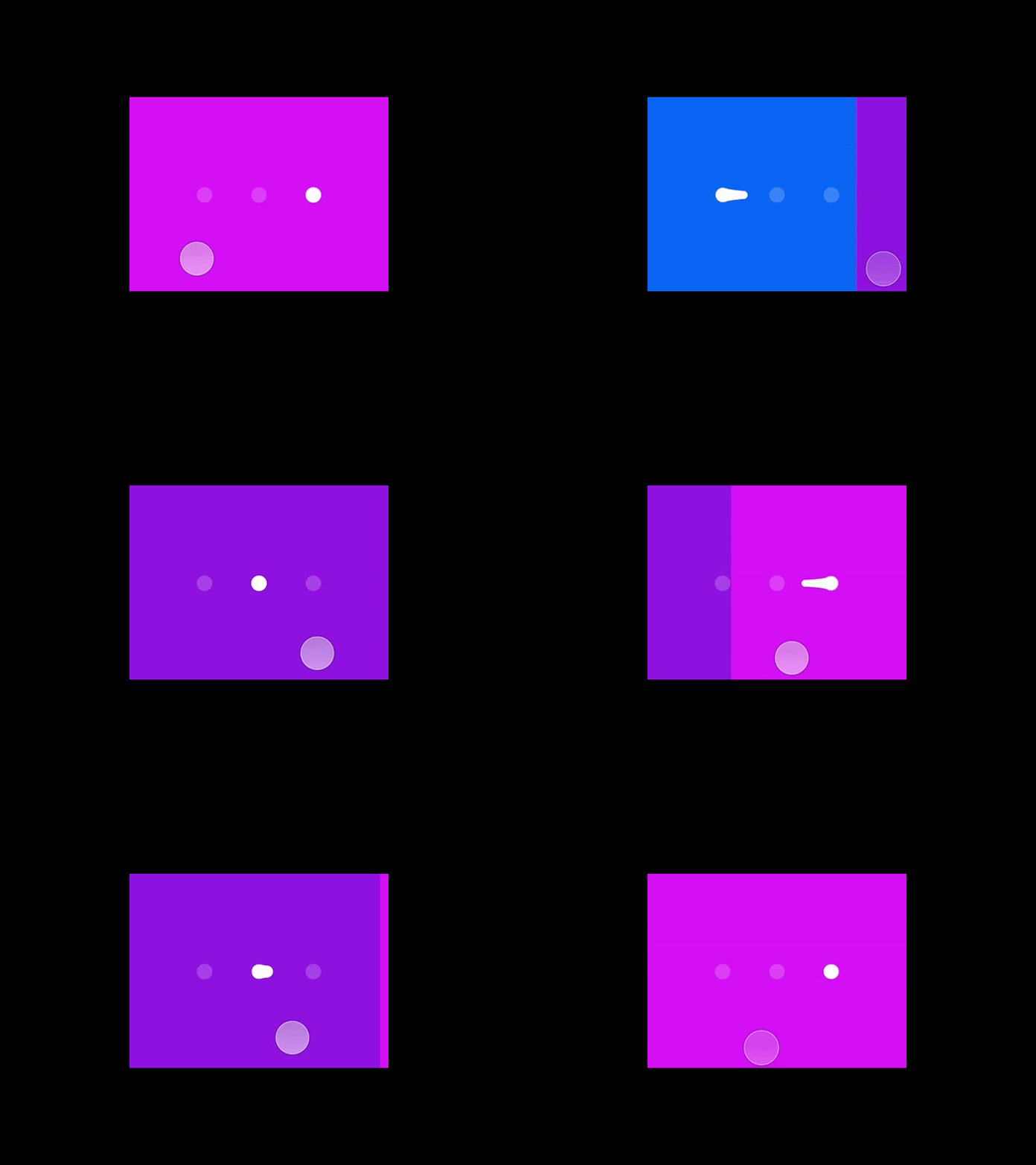
This is an example of a popular pagination animation in mobile apps called stretched pagination which creates a fluid user experience when users are navigating between sections. It can be used in apps where users have to quickly swipe between sections such as browsing product images in e-commerce, reading different sections of information in education apps, or going through steps to create a recipe for a food app.
You can find the downloadable Principle file for this interaction here.
5. Expand Cards with a Sticky Element
In UI design, a card list is a convenient method of presenting information in easily digestible chunks. Taking its cue from real-world methods of memorizing and organizing information using physical cards – such as flashcards or post-its – a card list shows a series of cards, each containing a small amount of bite-sized information. However, not all information that needs to be conveyed to the users can be boiled down to bite-sized data that can be displayed on cards. The real challenge of design therefore, is to balance the delivery of information in way that doesn't overwhelm the users.
Why this adds a wow factor - While navigating through the cards, users should get a clear picture of the information being conveyed while having an option to expand on this information and dig deeper, should the users choose to do so. Maintaining the continuity and fluidity of this expansion should be smooth and feel like a well-connected experience. This is where a simple animation like using a sticky element on the cards that stick when the card is expanded can be used to create a subtle, dynamic interaction.
Like with all the above interactions, let's take a look at an example of such an interaction design made in Principle.
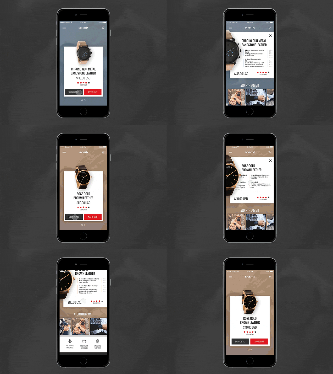
This design is used in an e-commerce concept app for watches to display cards of items that can be bought. The main information such as the price and rating needs to be displayed with each card. Expanding the card reveals additional information such as features and recommendations. The watch sticks to the expanded view to create a more connected experience when consuming the information needed for making a buying decision.
You can find the downloadable Principle file for this interaction here.
Intuitive to use and – when done right – often also aesthetically pleasing, an expansive card list can be an excellent way of structuring a responsive design for greater usability. This is especially true when aiming to improve the experience of navigating particularly content-heavy and information-laden apps.
Enjoyed this article? Don't miss out on more exclusive insights and real-life digital product stories at LeadReads. Read by Top C Execs.
Join here.
Where to go from here
Head over to the tutorials provided on the official Principle website to get a better understanding of the tool that design teams from companies like Apple, Amazon, Netflix, and Microsoft are using.
Windows users can check out alternatives to Principle such as UXPin and ProtoPie which provide a similar experience to prototyping designs.


